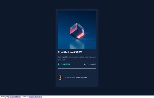
Submitted over 2 years agoA solution to the NFT preview card component challenge
NFT preview card component
@bilguun1130

Solution retrospective
How do I decrease the size between the bottom of the card and creator's avatar and info? The very bottom part has too much space between elements but I don't know how to decrease that size. Tried margin-bottom and did not work. Anyway, this is the best I can do for this one.
Code
Loading...
Please log in to post a comment
Log in with GitHubCommunity feedback
No feedback yet. Be the first to give feedback on bilguun1130's solution.
Join our Discord community
Join thousands of Frontend Mentor community members taking the challenges, sharing resources, helping each other, and chatting about all things front-end!
Join our Discord