Not Found
Not Found
Not Found
Not Found
Not Found
Not Found
Not Found
Not Found
Not Found
Not Found
Not Found
Not Found
Not Found
Not Found
Not Found
Not Found
Not Found
Not Found
Not Found
Not Found

All solutions

  • Submitted


    Hi,

    This is my solution to Advice generator app. I have added some cool animations to make it look better. Dice icon inside the button rotates while the advice is being loaded.

    The most difficult part for me was to time the animation properly. When the advice is loaded, the icon should complete its rotation before stopping. I did this using animation-play-state along with following JS:

      myElement.addEventListener('animationiteration', (e) => {
        // Stop animation by removing class or data attributes
      }, {
        once: true
      });
    

    If you have any suggestion or improvement idea, I would love to know!

    Thanks for checking out :)

  • Submitted


    Hi, This is my solution to to Calculator challenge. The most difficult parts for me were:

    • Creating the theme switch button
    • Adding keyboard support both via tab navigation and directly pressing keys
    • Creating the logic for a functional calculator

    I would love to hear feedback about these things along with any other issue that you see especially regarding accessibility.

    If you have any improvement idea, do let me know!

    Thanks for taking your time :)

  • Submitted


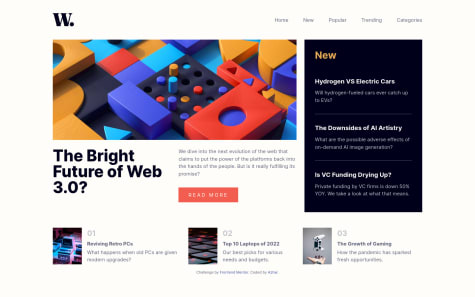
    This is my solution to News homepage using HTML, CSS and vanilla JS. I have tried to make it as much accessible as possible, if you have any suggestions please let me know

  • Submitted


    Hi all,

    This is my soution to Sunnyside landing page using plain old css and js. This wasn't that difficult to make but maybe I need to review my css more. If you find any issue or something that can be improved, do let me know! 😊

    Maybe adding some animation on scroll will be a good idea 🤔

  • Submitted


    Most difficult for me was to implement the responsive menu bar. I followed a tutorial from Kevin Powell that helped me. Another difficult part was to create the animated dark mode switch, which turned out good I think. One improvement that I think will be good is automatically closing the menu when clicked outside or when switching between mobile and desktop views. Maybe next time! Meanwhile, if you can give suggestions regarding the implementation, I will be very happy!

    Do let me know your thoughts!

    Thanks :)

  • Submitted


    This time I decided to go with React as I needed more control over states.

    Most difficult part for me this time were:

    • Using React! I am just getting started with React, so took a very long time.
    • Animating bars. I tried animating the bars using transform but the border radius were getting squeezed. I tried dividing the bars in to 3 parts: top, middle and bottom and used scale on middle and translate on top but was not able to achieve proper positioning. So for now I have just animated height.
    • Dark mode. For this I prefer to use Adam Argyle's way and it works perfectly for normal apps but I don't know how to migrate it to react project, i.e how to load and run the script before everything else and then bind to the theme button. I ended up removing most of the functionality to be able to use it with react.

    If you have any advice on how to handle bar animation and best way to integrate script for dark mode, do let me know.

    OR if you know how I can create a standalone "Dark Mode Switch component" that I can just integrate in other apps, please let me know!

    Thanks for checking out my solution 🙂

  • Submitted


    This is my solution for Article Preview Component with dark mode and cool circular expanding reveal animation for share menu in mobile view and fade-in animation in desktop.

    The most difficult part for me was to position the share menu in desktop mode. I ended up using properties and calc to calculate its position so that it stays in center even if we add more links later.

    Another part is accessibility. I did try to make it accessible but I am not sure if I missed something or overdid something.

    For show/hide share menu, I have used data attribute instead of toggling class which is as per cube-css methodology.

    For JS, I decided to use query selector instead of id. This allows to add multiple cards without any issue. But I think in real projects using any library like react, it is better to just use states.

    Do let me know your thoughts :-)

  • Submitted


    Profile card component with a little bouncy entry animation and a dark mode.

    The most difficult part for me was to position the background image. I failed to do that with background-image, so ended up using pseudo element with overflow: hidden;. Please let me know if you have any better solution (modifying the image is a good option I believe 😅)

    I also failed to apply filter on the card top image to match it with dark mode. When I applied filter to it, it covered the profile picture. If you have any idea, how to darken that image without breaking other things, do let me know!

  • Submitted


    I started with mobile first approach, but it centers the content. So basically I was changing the alignment and then overriding again in desktop view. Hence I decided to go with desktop first approach for the outer container.

    What do you think? Does it matter? Please share your opinion and if you notice some other issues, do let me know 🙂

  • Submitted


    Rating is taken using custom radio buttons. One can focus it using tab and then select the rating using arrow buttons. Since it uses input type radio, most of the accessibility is taken care of automatically.

    Most difficult part for me was to design the custom radio button. I ended up using "appearance: none;" to remove the default styling.

    If you have any suggestion, please feel free to let me know.

  • Submitted


    Any opinion regarding accessibility and use of html schemantics elements is highly appreciated.

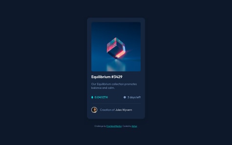
    Also what do you think about the approach of handling theme?