Design comparison
Solution retrospective
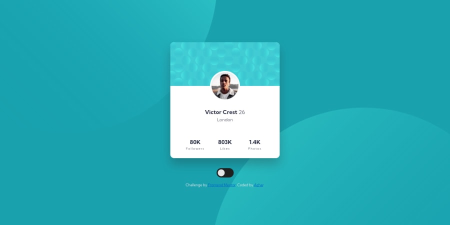
Profile card component with a little bouncy entry animation and a dark mode.
The most difficult part for me was to position the background image. I failed to do that with background-image, so ended up using pseudo element with overflow: hidden;. Please let me know if you have any better solution (modifying the image is a good option I believe 😅)
I also failed to apply filter on the card top image to match it with dark mode. When I applied filter to it, it covered the profile picture. If you have any idea, how to darken that image without breaking other things, do let me know!
Community feedback
- @michagodfreyPosted over 2 years ago
Hi Md Azharuddin, this is looking great. The bouncy feature and dark mode are working perfectly I think. A great way to enhance this project.
As for using pseudo elements for the background, the feedback I got for this challenge was that is the best way to go. The background is the hardest part of this challenge (without doing extras) and not really newbie territory imo.
As for the dark mode on image, I don't know how darkmode could be applied to an image, you'd need a separate image I think, or directly edit the fill property of the svg.
Marked as helpful0@azhar1038Posted over 2 years ago@michagodfrey Yes! How did I forget about
currentColorfor svg!Thanks I will try that and see how it goes 😀
1@azhar1038Posted over 2 years ago@michagodfrey Hi Michael,
I was able to do it with
background-image.
Please check and let me know your thoughts on this!0@michagodfreyPosted over 2 years ago@azhar1038 Looking good :) I also noticed you added the line, nice. You've nailed this one, great work!
0 - @elaineleungPosted over 2 years ago
Hi Md, this was the challenge I mentioned to you when I said I needed to use pseudo elements! Gave me quite the headache too 😅
About using a filter in dark mode, I think you can try doing what you did in the
theme-toggle.cssfor your profile photo class element, like this:[data-theme="dark"] .profile__photo { filter: brightness(0.8); }By the way I love what you did with adding dark mode here! 😊 I'd suggest also to put a
cursor: pointeron the dark mode toggle, since to me it always looks better when a pointer is there to indicate interactivity. Well done once again!1@azhar1038Posted over 2 years ago@elaineleung I thought so that maybe it is this challenge when I encountered the problem 😅
Regarding
filter, yes it works but then that card pattern image covers the profile picture. I even triedz-indexbut didn't work.I will change the cursor.
1@elaineleungPosted over 2 years ago@azhar1038 Oh woww I totally read your question wrong; I thought it was the profile photo you wanted to change, oops 😅😅😅
In that case, there's something you can try that I just tested in the inspector; the way to not cover the profile picture is to put
isolation: isolateon.profile__photo. I don't know which method you used for applying a filter, but anyway I just wrapped the svg<img>with a new<div>called.card-topand then added a line in the toggle theme. Everything looks like this:.profile__photo { // rest of your code isolation: isolate; } [data-theme="dark"] .card-top { mix-blend-mode: multiply; }Anyway, good luck and hope it works out!!
Marked as helpful0@azhar1038Posted over 2 years ago@elaineleung Thanks!
isolation: isolate;worked! I am usingfilter: brightness(70%) saturate(140%);for darkening the image.And I was able to do it with background-image instead of pseudo elements 🙂
1 - @BrunoleonardoDevPosted over 2 years ago
Por essa eu não esperava, parabéns pela ideia do dark mode! 👏🏾
1
Please log in to post a comment
Log in with GitHubJoin our Discord community
Join thousands of Frontend Mentor community members taking the challenges, sharing resources, helping each other, and chatting about all things front-end!
Join our Discord
