I need a review, and any feedback would be highly appreciated.
azgpapi
@azgpapiAll comments
- @oge-devSubmitted 10 months ago@azgpapiPosted 10 months ago
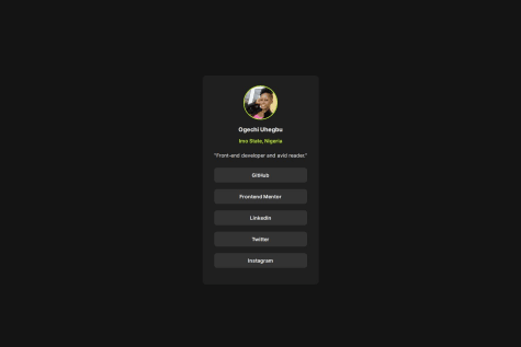
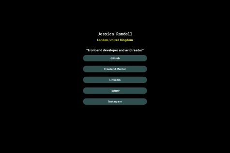
no feedback needed, it is good what advice i can assist you is you can align the ending and starting part of your name and address start equally and end equally, you can just work with their font-size property. The rest is amazing.
0 - @azgpapiSubmitted 10 months ago
A social-link built with css Flexbox. Come check this out!
@azgpapiPosted 10 months agoGuys please contact me, when pushing or I don't know it didn't contain the image, if you are interested contact me on that. Thanks for coming.
0 - @uddywebSubmitted 10 months ago
What I found difficult was deploying my site in Github , the image I used still did not appear on the site.
@azgpapiPosted 10 months agoVery good of you nice try, what I suggest you is if you can work on text property you may have the alignment correctly aligned equally the name and address. And the buttons you can just group them under one container and keep the alignment also equal. Overall very good keep on your journey. I will upload this code of mine also and try to check it and give me your feedback also.
Marked as helpful0 - @azgpapiSubmitted 10 months ago
I want to the community of FrontEnd Mentor to see my code and give me an advice. Specially, I want to really work on organizing my structure and so on. Thanks guys.
@azgpapiPosted 10 months agoI just wanted to let you know guys, I missed uploading the image file to the git that's why and yeah ofcourse you know that but I hope my submission is very helpful, and I want you to review it and give me a feedback. I want you also to review my structure.
0 - @paschalmarioSubmitted 10 months ago@azgpapiPosted 10 months ago
You have made it buddy, it seems you have a basic understanding of how the css Flexbox really works.
0
