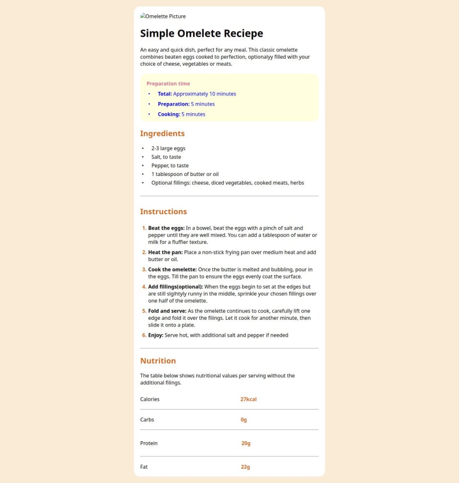
Design comparison
Solution retrospective
I want to the community of FrontEnd Mentor to see my code and give me an advice. Specially, I want to really work on organizing my structure and so on. Thanks guys.
Community feedback
- Account deleted
Looks good, my suggestion is for the centering the whole thing i nomally do this.
body {
    display: grid;
    place-items: center;
    min-height: 100svh/vh/dvh; //svh and dvh are mainly for mobile view, it's for when you have the search bar at the top of the menu screen on mobile.
}
Also I would avoid adding heights to anything as the div should be fine with its auto height. You only mainly uses heights for small things and for a main hero section that has a image for a site.
Also with your lists try just sticking with the <ul> <ol> tags, you can customize the dots through css like this
<ul class="custom-bullets">
  <li>List item 1</li>
  <li>List item 2</li>
  <li>List item 3</li>
</ul>

ul {
  list-style-type: none; /* Remove default bullets */
}

ul.custom-bullets {
  list-style-type: none; /* Remove default bullets */
}

ul.custom-bullets li::before {
  content: "•"; /* Unicode for bullet character */
  color: #ff0000; /* Color of the bullet */
  font-size: 20px; /* Size of the bullet */
  margin-right: 10px; /* Spacing between bullet and list item content */
}
Also i noticed with the nurtrition at the bottom the first digit is off to the left I willgive you some code that can achive the result you want.
HTML
<div class="nutrition">
        <div class="nutrition-item">
            <p class="nutrition-title">Calories</p>
            <p class="nutrition-info">27kcal</p>
        </div>
        <div class="nutrition-item">
            <p class="nutrition-title">Carbs</p>
            <p class="nutrition-info">0g</p>
        </div>
        <div class="nutrition-item">
            <p class="nutrition-title">Protein</p>
            <p class="nutrition-info">20g</p>
        </div>
        <div class="nutrition-item">
            <p class="nutrition-title">Fat</p>
            <p class="nutrition-info">22g</p>
        </div>
    </div>
CSS
* {
    box-sizing: border-box;
    padding: 0;
    margin: 0;
}

body {
    display: grid;
    place-items: center;
    min-height: 100svh;

    color: #18181b;
}

.nutrition {
    width: 400px;
    border: 1px solid #1e293b;
    border-radius: .5rem;
}

.nutrition-item {
    display: flex;
    align-items: center;

    padding: 1rem;
}

.nutrition-item:not(:last-child) {
    border-bottom: 1px solid #94a3b8;
}

.nutrition-title {
    font-weight: 600;
    font-size: 1.125rem;
}

.nutrition-info {
    margin-left: auto;

    color: #ea580c;
    font-weight: 700;
}
I hope this helps and if you have anything else you want to know i will be more than happy to help.
Marked as helpful0@azgpapiPosted 10 months ago@Benjihunt97 Thank you buddy, really helpful, am seeing that you are trying to help specially on structuring my html elements and thinking like a programmer. Really helpful and though am a beginner your suggestion is really helpful. Thank you!
0 - @azgpapiPosted 10 months ago
I just wanted to let you know guys, I missed uploading the image file to the git that's why and yeah ofcourse you know that but I hope my submission is very helpful, and I want you to review it and give me a feedback. I want you also to review my structure.
0
Please log in to post a comment
Log in with GitHubJoin our Discord community
Join thousands of Frontend Mentor community members taking the challenges, sharing resources, helping each other, and chatting about all things front-end!
Join our Discord
