React
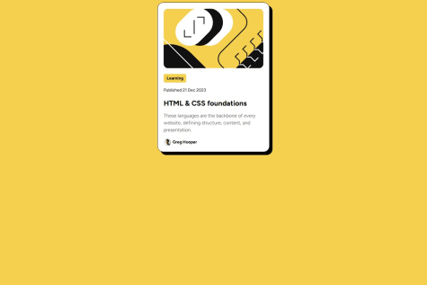
This is my first time building a React project from draft, it's a little painful to make React app run locally, but I really appreciate myself for struggling to figure everything out, because now I have much more understand about how a React project runs, and how should the folder structure be.
In this project, I use the map() function to go through a list of my social links:
        {links.map((button, index) => (

        ))}
and for the buttons, I use a Button component to return different social link buttons back to the App.jsx file.
function Button(props) {
  return (

      {props.name}

  );
}
CSS
This time I try to use the concept of RWD to make a user friendly website, and though I still have some hardcoded parts, the website is more responsive than before.
What challenges did you encounter, and how did you overcome them?In the process of making React app run locally, I feel really helpless because the problem I have met seems not the most "popular" question (maybe because it's a little stupid). So I tried again and again installing Vite, and the last time I installed it, I didn't simply move my file in the folder, instead I copy all my code into the native file in the my-react-app folder since it's more easier to understand how its file structure is, and thank god it works.
If you are a CSS master, please help me about the responsive parts😭
First, my CSS code still have many hardcoding part, I know there are some ways like setting the width or margin etc by percentage or rem/em, but how can I confirm the result would be exactly same as the design I want to achieve?
Besides, for some reason my mobile version can work on my desktop browser perfectly, but the spaces between the card and the edge of screen will disappear when I open the live site on my phone.
If you have any idea, please comment below 🥹 Thank you very much!


