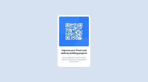
My QR Code component solution

Solution retrospective
I started learning HTML & CSS on my own not long ago, in preprations for a 4 month fullstack bootcamp starting soon. This is my 1st project here, I'm proud I was able to get it done, and that it looks pretty similar
What challenges did you encounter, and how did you overcome them?It was pretty straight forward
What specific areas of your project would you like help with?I think I'm lacking in the resposivness part of the project, would love to get some pointers threre, I'm assuming I should use some sort of @media, but I haven't really gotten to that part in my studies.
I'd also like to know if I have any lines of code which are redundant, so I can improve on slimming down my code (E.G - a few lines of code which can be replaced by just one that does the same thing)
Please log in to post a comment
Log in with GitHubCommunity feedback
No feedback yet. Be the first to give feedback on IAmOrale's solution.
Join our Discord community
Join thousands of Frontend Mentor community members taking the challenges, sharing resources, helping each other, and chatting about all things front-end!
Join our Discord