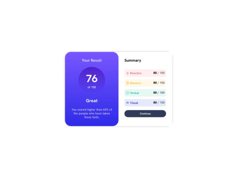
@gomegdevSubmitted 10 months ago
Create using HTML and Tailwind CSS. All feedback is welcome! Thanks!!!

Create using HTML and Tailwind CSS. All feedback is welcome! Thanks!!!
Great job you're doing with Tailwind!
Just a piece of advice, I would move the border-width: 2px to the class instead of the :hover. That would help with better visualization.
There's an error in the .box class; you're using display: flex and height: 100%, which will cause the child elements to separate to occupy the entire height. I suggest removing the display: flex and setting a maximum width: css .box { width: 100%; max-width: 375px; } The elements inside .inner-section should have padding to give the information some breathing space, and I recommend increasing the text size of your button: .inner-section { padding: 10px; /* Adjust the value as needed / } .button { font-size: 1.2em; / Adjust the text size as needed / } I recommend changing the card orientation only for screens wider than 700px. You can achieve this using CSS media queries: @media screen and (min-width: 700px) { .box { flex-direction: row; / Or adjust the property as needed */ } } The rest looks excellent! Keep up the learning!