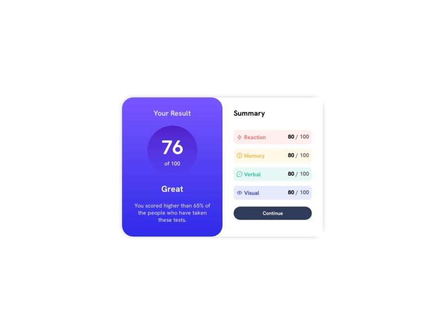
result summary component with css grid and css flexbox


Design comparison

Community feedback
- @alexguemarPosted 11 months ago
There's an error in the .box class; you're using display: flex and height: 100%, which will cause the child elements to separate to occupy the entire height. I suggest removing the display: flex and setting a maximum width: css .box { width: 100%; max-width: 375px; } The elements inside .inner-section should have padding to give the information some breathing space, and I recommend increasing the text size of your button: .inner-section { padding: 10px; /* Adjust the value as needed / } .button { font-size: 1.2em; / Adjust the text size as needed / } I recommend changing the card orientation only for screens wider than 700px. You can achieve this using CSS media queries: @media screen and (min-width: 700px) { .box { flex-direction: row; / Or adjust the property as needed */ } } The rest looks excellent! Keep up the learning!
0

Please log in to post a comment
Log in with GitHub
Join our Discord community
Join thousands of Frontend Mentor community members taking the challenges, sharing resources, helping each other, and chatting about all things front-end!
Join our Discord