Skip to content
Learning paths
Challenges
Solutions
Articles
Unlock Pro
Log in with GitHub
Profile
Overview
Solutions
3
Comments
0
Yafi Abyan
@abyanfalah
Follow
All solutions
Submitted over 1 year ago
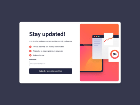
Responsive newsletter signup HTML Vue TailwindCSS
HTML
CSS
JS
2
6
0
Submitted over 1 year ago
Responsive result summary using HTML Vue and TailwindCSS
HTML
CSS
1
5
0
Submitted over 1 year ago
Flexbox QR code component
HTML
CSS
2
4
0
