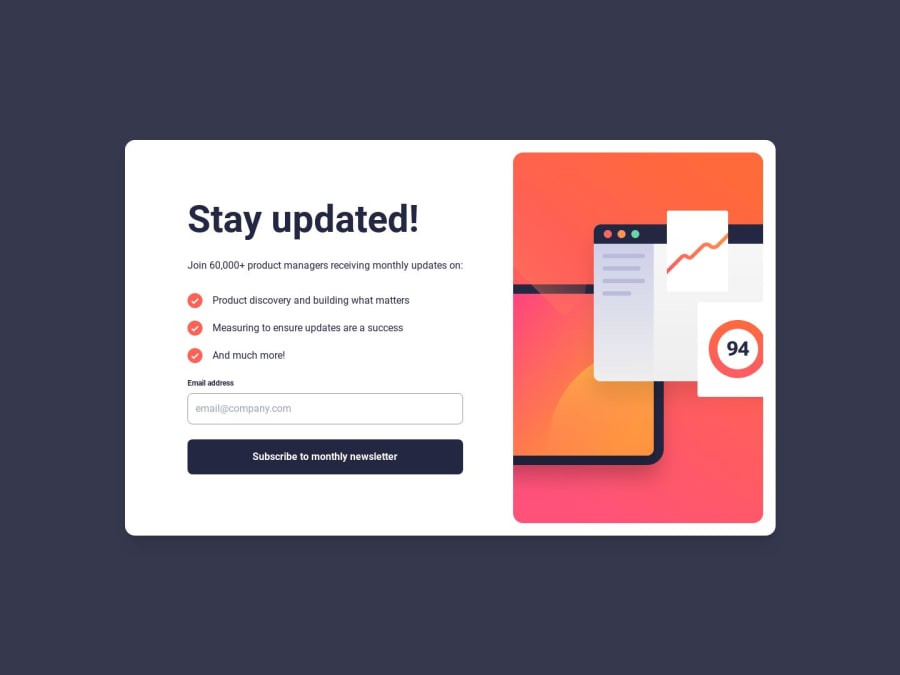
Responsive newsletter signup HTML Vue TailwindCSS


Design comparison

Solution retrospective
My main focus is responsive design so please have a look on the live site and tell me if there is anything wrong with the responsiveness.
I use flex-column for the mobile design and turn it into flex-row-reverse for the desktop design, I wonder if it's the right way to do so. Please let me know the best practice for this kind of design.
There is some gap on the bottom of screen on the signup screen when I check the site from my phone. Tried to tweak some of the tailwind classes but got no clear idea why the gap exists. Please let me know if spot the cause.
Feedback on any aspect is welcome! Thank you!
Community feedback
Please log in to post a comment
Log in with GitHub
Join our Discord community
Join thousands of Frontend Mentor community members taking the challenges, sharing resources, helping each other, and chatting about all things front-end!
Join our Discord