Abiel Bright
@abie237All comments
- @Abdullah-AboalmSubmitted about 1 year ago@abie237Posted about 1 year ago
Review this . They may be an error somewhere with the link to the styles files . Or you did not deploy it correctly
Marked as helpful0 - @lrdelmarSubmitted about 1 year ago
I found it difficult to align the qr component in the center vertically so I did a bit of searching around and found a solution on Stack Overflow, which was to use absolute positioning and set the position to 50% and use transform translate by -50%.
I am wondering if this is best practice? I am able to center content using flexbox but this only seemed to be working horizontally and not vertically. When using align-content it didn't seem to move. I thought maybe I needed to set a height for this to work but it didn't have any effect.
I had originally created padding around the qr image however this created problems with the border-radius, so I changed this to margin and set the image to 90% width instead.
@abie237Posted about 1 year agoWell done bro ! You already have the habits of a great programmer ! RESEARCH is key !
what i propose is that inside the Qr Container you could create two respective divs ; one for the image and one for the text content
To fit the image in its div use width:100%,height:100%,and the object-fit: cover.
Marked as helpful0 - @suleymanmutlSubmitted about 1 year ago
- @JenaCarrySubmitted about 1 year ago@abie237Posted about 1 year ago
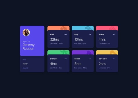
Hi, The design is perfect . The only thing you have to change is the display when it shows 1hrs instead it should be 1hr (without the s)
Marked as helpful1 - @MatiasVignolaSubmitted about 1 year ago
Solution of responsive order summary card using CSS
@abie237Posted about 1 year agoToo much space a the end of you container which may result from too much padding or fix height set. you can fix this by using "max-height" instead of explicitly defining the height
Marked as helpful0 - @SanjuakaSanjaySubmitted about 1 year ago


