@Zein-MB
What are you most proud of, and what would you do differently next time?
Hello Community!👋
This is my solution for this challenge, hope you like it.🙏
Any feedback/recommendation is welcome!
Have a good day and happy coding.✨👨🏻💻

Hello Community!👋
This is my solution for this challenge, hope you like it.🙏
Any feedback/recommendation is welcome!
Have a good day and happy coding.✨👨🏻💻
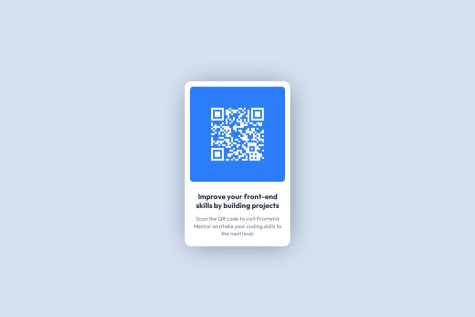
Note: The preview image is empty due to some animation customizations on the website using IntersectionObserver() constructor.
I’m most proud of launching my first-ever live website. It’s exciting to step away from learning and test my abilities in real-time.
I’m still learning, so I know I’ll make mistakes, but I’m eager to learn from each one.
What challenges did you encounter, and how did you overcome them?CSS was my greatest challenge. There are a lot of best practices, do's and don'ts that I didn’t fully adhere to. Additionally, I found myself re-inventing the wheel a lot while styling certain elements. Thankfully, research and AI came to the rescue.
What specific areas of your project would you like help with?CSS, definitely! There are a lot of nuances and styling techniques that are still new to me. I'm eager to learn them all and would appreciate any guidance in these areas.
Hello there👋
Congratulations on finishing this challenge
I have a little note, try adding some box shadow to make it fit with the design, that's all.
Otherwise your solution is perfect.
Have a nice day✨
Hello there
I have a note about:
border-radius which must be little bit more.
you can make the script depending on giving random advices not ordered ones.
You did well in the UI there, good job! 👏
Have a good day !
Hello There
Good job on that one, I'd like to notify you about the line-height property in these three boxes, it must be stretched a little bit more,
Have a good day!
Hello there mate,
Good work on this challenge I'd suggest you this box shadow on the main container.
box-shadow: 0px 40px 40px -10px rgb(183 199 216 / 30%);
Have a good day and happy coding
Hello Eyelin, congratulations for finishing this solution!
Great job here, it's completely identical
I just have a note about the box shadow, I think it should has more thickness
Have a good day and happy coding
Regards
Amazing! you're just an example of success!!
Hey Catherine I have a note about the cursor of the input, if you can make it "text" so that'd be better than "pointer", Good job! and have a good day. Regards.
You're just doing fine with this way in designing environment mate ! I liked the responsive part modifying.. Great job as usual Also,, Gratz for the 300 point!
Hello, There's a note about line height of the written text i think it's a little bit tight, and take care about the svg placement onto the background, For responsive, no worries, undoubtedly you have to train yourself gradually on it, this problem is happening with me all the time, all you've got to do is trying, Hope this helped you, Regards.
I loved your design precision, good job mate!
Disclaimer! The token screenshot is a little bit wrong if you want to check it out visit the site.
It would be more softer if you put transition 0.3s to the button Good job by the way!