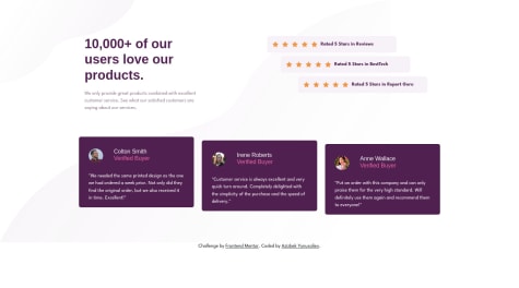
Hi! Thank you for taking a moment to look at my solution. I welcome any feedback you may have. Some questions I have are: what method do you use to break down a design into sections? I feel like I have extra divs/sections/etc that could be eliminated to simplify the code, but would like advice.
Wonski312
@Wonski312All comments
- @kiersten-cSubmitted about 2 years ago@Wonski312Posted about 2 years ago
I think would you did is all good with sections etc but could be done without them at all because this project looks a bit like component so just divs with classes set accordingly would be enough.
As you can see in your report Section class payment button require h2 tag but I would say it’s not necessary in this section so with div you will avoid it
I think displayflex should be assigned to body element because you are positioning whats in body as parent element not the whole html file. After that add height:100vh and you probably will not need margin top on your body element which probably should be on content wrapper class.
Well done for your work and good luck with next one:)
Marked as helpful0 - @FatimaGRSubmitted about 2 years ago
Hi! I would appreciate it if you give me feedback on how I use flexbox in this project to center the QR card
@Wonski312Posted about 2 years agoYes as above you can youse justify-content and align-items with flex to centre your box container on the body. Setting img size with px may couse problems with responivnes if you will still use it like that instead of width 100%. And all content could be set with flex direction column Paragraph with title class could have h1 so it’s more semantic and in challenge directions you have font size set to 15px so you could set it straight away in your body set up
Well done and good luck with your next projects
Marked as helpful1 - @azick99Submitted about 2 years ago
Hello there, You are welcome to give me some some feedbacks and question. I have tried to do my best let me know please if there any edition or improvements to my code. Thanks a lot!!!
@Wonski312Posted about 2 years agoI am still learning but does it make sense to add responsivnes max width in responsive css ? All mobile styling could be done in main style as mobile first rule styling and then add queries to large screens in other file.
Other than that result very similar to design and code is readable. But star components a little bit out of line with main components and title could have a bit bigger font
Well done good luck with other projects
Marked as helpful0


