Is there any ratio for the border-radius property to a parent and child component?
Whale Well Well
@WhaleWellWellAll comments
- @lcabrera13Submitted almost 2 years ago@WhaleWellWellPosted almost 2 years ago
Hi Luis! Here is a tip for you:
-
Make sure all your images have an
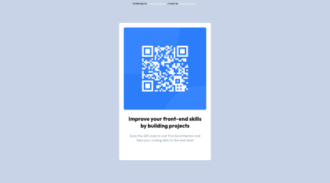
altand that it is descriptive. For example, I might put 'alt="QR code to frontendmentor.io"'. -
Instead of using the
role="main"attribute, consider using the <main> tag instead or removing the role. it might confuse the screen reader.
Hope this helps, WhaleWellWell
Marked as helpful0 -
- @treytallentSubmitted almost 2 years ago
One issue is that my full-screen navigation is center aligned on Safari but it works on live servers and Chrome
@WhaleWellWellPosted almost 2 years agoHi! Here are some tips you might find useful:
-
Make sure that all
<section>tags have an<h2>-<h6>on them. if they do not, try substituting in a different tag like<main>or something else. -
Just check if your background is correct. It looks slightly whiter than the design.
Hope this helps, WhaleWellWell
1 -
- @sand-storm-17Submitted almost 2 years ago
Is there anything i can improve upon? What resources would help me do a better job at doing this?
@WhaleWellWellPosted almost 2 years agoHi! I have a tip for you:
- Make sure all images have a alt attribute. This helps screen readers and should be an explanation of you image. For example, I might do:
<img **alt="QR Code to frondendmentor.io"** class="qr-image" src="/images/image-qr-code.png">This explains what the image is there for.
Hope this helped, WhaleWellWell
1 - @owocodedSubmitted almost 2 years ago
just submitting a frontend challenge. any feedback on how to improve will be welcome
@WhaleWellWellPosted almost 2 years agoHi! Overall great project and code, but here is some advice I think you will find helpful:
- I see that there is a div with a class of main:
<div class="main">. To make this site better for screen readers you could add the role of main to your div or wrap your div in a<main>tag.
<main>
  <div class="main">
    CODE
  </div>
</main>
or:
<div role="main" class="main">
  CODE
</div>
It is suggested you use the
<main>tag but either one will work. MDN docs explain it better than me :)- I see you have an
<h4>in your order component for your smaller heading. I recommend you just use an<h2>instead because the heading tags are mainly for your site's outline and semantic order and not the for the style. If you want your text to look about the size of an<h4>that is fine, you can make it look like that in your CSS. If you want took look farther into this here is a the MDN docs on the heading tags. It has the explanation under "Usage Notes"
Hope you find my advice useful, WhaleWellWell
Marked as helpful0 - I see that there is a div with a class of main:


