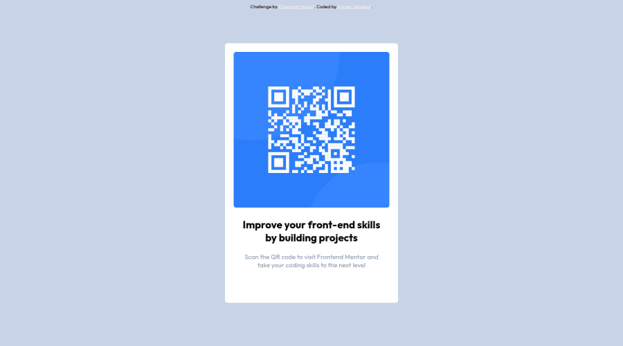
QR-COMPONENT using Responsive CSS and HTML
Design comparison
Solution retrospective
Is there anything i can improve upon? What resources would help me do a better job at doing this?
Community feedback
- @hatemhenchirPosted almost 2 years ago
Hey Kumar Sandeep, how are you ? I really liked the result of your project, but I have some tips that I think you will enjoy:
-
It's a bad idea to center a div or a container using
position: absolute; top: 50%; left: 50%; transform: translate(-50%, -50%); -
to center the card, you can use flex like this :
body{display: flex; justify-content: center; align-items: center; height: 100vh;}or you can use a grid like this :body{display:grid;align-items: center;height:100vh} -
the color of the title is
color:hsl(220, 15%, 55%);
The rest is great!
If you have any questions or need further clarification, feel free to reach out to me.
Happy Coding! 🍂🦃
Marked as helpful2 -
- @WillieSantosPosted almost 2 years ago
Hi!
In the original design, a rounded edge is noticeable. Try to include a border-radius in the project, it will look more like it.
1 - @WhaleWellWellPosted almost 2 years ago
Hi! I have a tip for you:
- Make sure all images have a alt attribute. This helps screen readers and should be an explanation of you image. For example, I might do:
<img **alt="QR Code to frondendmentor.io"** class="qr-image" src="/images/image-qr-code.png">This explains what the image is there for.
Hope this helped, WhaleWellWell
1
Please log in to post a comment
Log in with GitHubJoin our Discord community
Join thousands of Frontend Mentor community members taking the challenges, sharing resources, helping each other, and chatting about all things front-end!
Join our Discord
