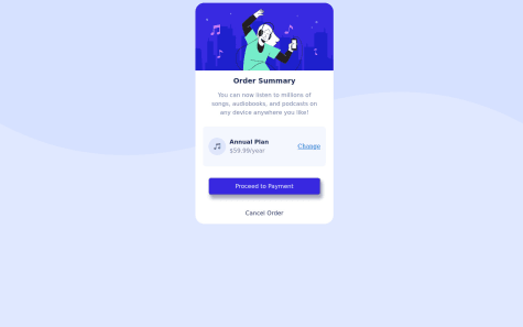
struggled with overlays and getting the image to be on the right hand side on desktop site.
Tjaša Žilavec
@TjasaZilAll comments
- @Mzu-SociSubmitted almost 2 years ago@TjasaZilPosted almost 2 years ago
Hi Mzu Soci,
good job on the challenge. I remember struggling with it myself when I first tried to solve it. I looked at your code and live site and I have a suggestion that you may take into account.
At
@media (min-width: 600px)you change your wrapper to havemax-width: 1100px;. The wrapper is wider than the screen and it looks cut off on screens that are less than 1100px wide. Based on your code I think that the best solution is to change@media (min-width: 600px)and@media (max-width: 600px)to@media (min-width: 1050px)and@media (max-width: 1050px). You can also eliminate the.wrapperclass from the@media (min-width: 1150px)and addwidth: 1100px;to the.wrapperthat is outside the media queries.I hope my writing makes sense. Keep up the good work! Cheers 🥂
Marked as helpful0 - @Agil-SaputraSubmitted almost 2 years ago
What should I do to improve this project? What your honest opinion about my code? Do you think I should use framework such as react and tailwind to build this project?
@TjasaZilPosted almost 2 years agoHi Agil,
good work on the project. To enhance your code you can put the navbar section outside of the main component and wrap it into
<header>tag. You can read more about the tag and why it is used here. I also see that all of your pictures do not have an alt attribute. Some of the alt attributes are empty. It is good practice to describe the picture in the alt attribute, just in case, the user can not see the image (slow connection, broken src or the user uses a screen reader).I do not think you need to use any frameworks with this project, as it is pretty simple. Basic HTML, CSS, and a bit of JS are enough. You can redo the challenge once you know some frameworks if you want.
Otherwise, you are doing great :)
Cheers! 🥂
1 - @dknydSubmitted about 2 years ago
Hi Guys,
Another of my earliest projects, but here I would have an actual important question:
In the example picture, the image on the right has some kind of purple filter on it which I have no idea how to recreate, if you have any suggestion, please let me know. :)
Trezmor
@TjasaZilPosted about 2 years agoHi Trezmor. I say that you wrapped your image in a div. try adding a purple background color to the div around the image. This should put a purple color above the picture. You will probably have to adjust the opacity of the background.
I hope that helps :)
0 - @EviteeSubmitted over 2 years ago@TjasaZilPosted over 2 years ago
Hi EviTee!
Good job on your solution!🥂 I see that you did not link your CSS and HTML files properly. Try
href="styles.css"instead ofhref="../styles.css"in your link tag and this should solve the issue. Also, try and use<h1>instead of<h2>since this is the main/only heading. You can style it accordingly with CSS.Other than that I have skimmed your code and it looks nice. 👌
I hope this comment will be helpful to you.
0 - @Gamajunior6Submitted over 2 years ago
Your responses are much appreciated.
@TjasaZilPosted over 2 years agoHi Gamajunior!
Good job on your design! I have a few suggestions for you to consider, that will make your solution closer to the design.
Here are some of the CSS changes that you can implement:
- You can change
height: 400px;in the body tag toheight: 100%. After that, you can add:
position: absolute;
top: 50%;
transform: translate(0, -50%);
this will center your card on all devices.
- You can style your button with
border: none;to get rid of the border around it and make it look closer to the solution.
Some HTML changes:
- The
<div class="Card" >around your image is not necessary for this project, so you can delete it. - Instead of using
<br>in your<p>tag it is better practice to style the text with CSS. Try addingwidth:270px;to.Contentand deleting<br>from HTML. It will give you the same result. - Look into semantic HTML. Using tags like
<main>,<header>,<footer>... makes the site more accessible and most of the time also easier to style. Try to use <div> only when necessary.
Hope it makes sense, you can have a look at my solution for this challenge to have an idea.
Marked as helpful1 - You can change


