@HusseinAkoredeSubmitted almost 2 years ago
Stephen Thagana
@StephenThaganaAll comments
- @StephenThaganaPosted almost 2 years ago
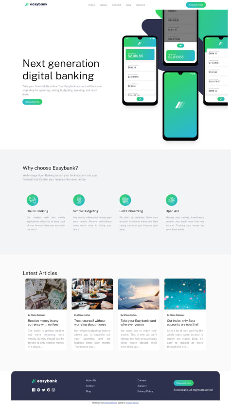
hey hussein, great solution to the challenge but for the section with articles i suggest max-width > 978px or so let the flex items not wrap for consistency..Thanks and happy coding👏👏
Marked as helpful0 - @cyber12341Submitted almost 2 years ago
what is the best practice for measurement unit is it rem, em, px, etc?
@StephenThaganaPosted almost 2 years ago- FLUID LAYOUTS
-To allow webpage to adapt to current viewport width(or even height) use % (or vw / vh) instead
of px for elements that should adapt to viewport
2)RESPONSIVE UNITS
- use rem unit instead of px for most lengths i.e fontsize to make it easy to scale the entire layout(up or down) autmatically 3)FLEXIBLE IMAGES
- images dont scale automatically as we change viewport so use % for image dimensions
Marked as helpful0 - FLUID LAYOUTS
-To allow webpage to adapt to current viewport width(or even height) use % (or vw / vh) instead
of px for elements that should adapt to viewport
2)RESPONSIVE UNITS

