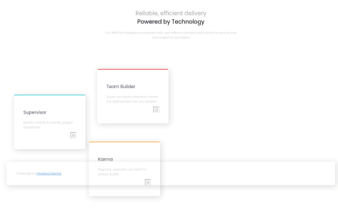
I don't understand. When I do the live view of my work from Vs code it is working but when I upload it to vercel it is distorted. Looking ofr feedback. Thanks
Samyr Oliveira Ribeiro
@SamyrORAll comments
- @domiattawaySubmitted almost 4 years ago@SamyrORPosted almost 4 years ago
Hi Dominique!
Looking into your repository, i din't find the img files, thats why the files don't show on the live site, and the style on repository maybe its not complet?
I've cloned the repository and look like the same.
Obs: vercel push from your git!
0 - @l-lainoSubmitted almost 4 years ago
Hi, I'm trying to get serious about learning web development. There are some things that I'd like to do better in the viewport, it just doesn't look right on mobile. Should I start a site from mobile and then scale it to a browser? I'd like to hear (read) everything that I could do better. Thanks for the attention.
@SamyrORPosted almost 4 years agoHello @l-laino, its look good at all, but somethings a think can be better, for best pratices you could put all colors that you will use, on variables of css, putting this on :root {}, this help in the maintence of the code (possible to put common sizes too and other things), matching all colors with the recived style guide , and for the bottom status under the numbers, you could space it with "letter-spacing" property.
At the mobile, i would add more margin on top to center the card, and match the font-sizes to better view with media queries.
The Mobile First aprochion, is a thing that i'm learning and loving it, you can code the entire site to mobile, and then with media queries just scale, this is much more easier, confortable than just try to make it fit on mobile, you could give a try, and look for mobile first.
I expect that i have helped in something.
2

