suggestions welcomed
Sahil Yadav
@Sahil-YadavAll comments
- @mansi05041Submitted over 3 years ago@Sahil-YadavPosted over 3 years ago
Do you use a bigger display screen or it's just not centered?
1 - @Billy-tech133Submitted over 3 years ago
How do I improve on writing more effective code?.
@Sahil-YadavPosted over 3 years agoEverything is good but in the desktop view the whole thing is shifted to the top(it should be in the middle) and the "per month" should be also aligned to the "$29".
0 - @iCromixSubmitted over 3 years ago
Feedback would be greatly appreciated!
@Sahil-YadavPosted over 3 years agoWhen it is in mobile view there is no space on the top and the bottom of the whole thing. There is unnecessary space below the discover paragraph(in the desktop view). Everything else is good.
1 - @MostafaMofeed67Submitted over 3 years ago
need some advise
@Sahil-YadavPosted over 3 years agoIf you see carefully there are shadows given to the divs(but this is not a problem). But all the content in shifted to the top, it isn't in the middle. Everything else is good.
1 - @SteelModsSubmitted over 3 years ago
Este es mi primer reto. Estoy abierto a cualquier crítica constructiva sobre mi código. :D
@Sahil-YadavPosted over 3 years agoYou haven't added shadows to the divs. And there is unnecessary white space at the bottom of kira's div.Everything else is good.
0 - @tin-phamSubmitted over 3 years ago
Feel free to give any feedback or ask any question ^ ^
@Sahil-YadavPosted over 3 years agoYour top headers should be aligned left. Everything else is good.
0 - @adilsongbSubmitted over 3 years ago
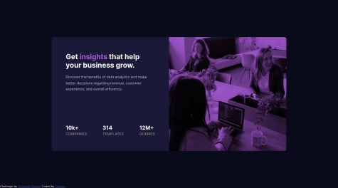
how does the image get that color? is it possible with css?
@Sahil-YadavPosted over 3 years agoOne thing you can do is giving the image that color background and then blend it with the background Or you can implement the image through css background-image property and then use linear-gradient.
1 - @ethabhijitSubmitted over 3 years ago
Hello Everyone, can anyone give me some feedback about the design.
@Sahil-YadavPosted over 3 years agoIt's good but there is a lot of unnecessary white space that shouldn't be there. That is easy to fix.
0


