Skip to content
Learning paths
Challenges
Solutions
Articles
Unlock Pro
Log in with GitHub
Profile
Overview
Solutions
7
Comments
2
SD_Voyez
@SD-Voyez
Follow
All solutions
Submitted about 2 years ago
Social Proof Section - HTML/ CSS Flexbox
HTML
CSS
1
6
0
Submitted about 2 years ago
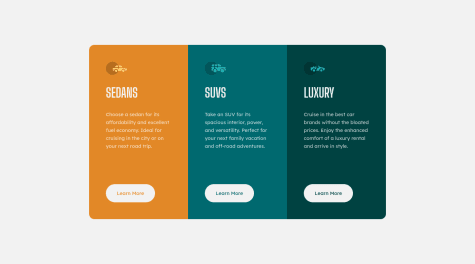
3 column preview card
HTML
CSS
1
4
0
Submitted about 2 years ago
Challenge Profile Card Component
HTML
CSS
1
5
0
Submitted about 2 years ago
Order Summary Challenge
HTML
CSS
1
3
0
Submitted about 2 years ago
NFT Preview Card
HTML
CSS
1
3
0
Submitted about 2 years ago
Product preview card component
HTML
CSS
2
6
0
Submitted about 2 years ago
QR code component - HTML / CSS
HTML
CSS
0
5
0
