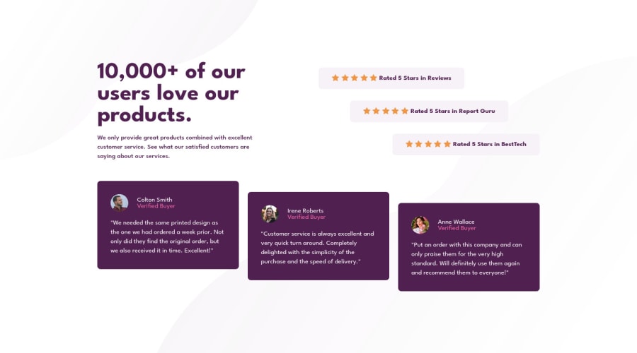
Design comparison
Solution retrospective
Well, ok in full screen, ok at 375px... but between those two... nop
Should try to code "mobile first" now.
Community feedback
- @VCaramesPosted about 2 years ago
Hey there! 👋 Here are some suggestions to help improve your code:
-
To not only improve your HTML’s code but to identify the main content of you page, you will want to wrap your entire component inside the Main Element.
-
The stars serve no other purpose than to be decorative; They add no value. Their Alt Tag should left blank and have an aria-hidden=“true” to hides it from assistive technology.
-
For the profile images Alt Tag Description, it should never* include the following keywords; “image”, “photo”., “picture” and any variation of them.
-
To improve the semantics of your component, you want to wrap each individual testimonial component in a Figure Element, the individuals information should be wrapped in a Figcaption Element and lastly, the testimonial itself should be wrapped in a Blockquote Element.
Code:
<figure>
   <figcaption></figcaption>
   <blockquote></blockquote>
</figure>
More Info:
- Implement a Mobile First approach 📱 > 🖥
With mobile devices being the predominant way that people view websites/content. It is more crucial than ever to ensure that your website/content looks presentable on all mobile devices. To achieve this, you start building your website/content for smaller screen first and then adjust your content for larger screens.
If you have any questions or need further clarification, feel free to reach out to me.
Happy Coding! 🍂🦃
Marked as helpful1 -
Please log in to post a comment
Log in with GitHubJoin our Discord community
Join thousands of Frontend Mentor community members taking the challenges, sharing resources, helping each other, and chatting about all things front-end!
Join our Discord
