


@mcwachiraSubmitted about 4 years ago
Latest comments
- P@RajCutinhaPosted about 4 years ago
Hello if you really struggle with mobile responsiveness i would suggest this free course from Kevin Powell. I also struggled with it and this course helped me. Take the time and do the challenges there you will improve fast. Here is the Link: https://courses.kevinpowell.co/conquering-responsive-layouts
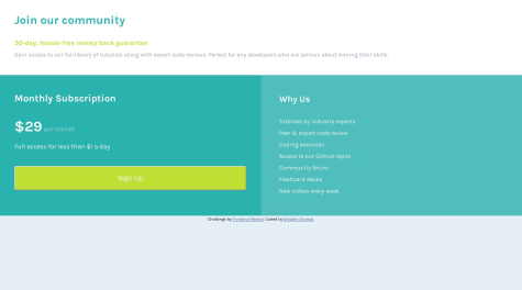
0 - @EnjegheOSubmitted over 4 years agoP@RajCutinhaPosted over 4 years ago
Hello here is a List of what i would do after looking into your Site. Your Mobile Site looks good to me.
- Add a max-width to your flex-container i think 800px is fine// At some point items need to stop growing
- U should use % values for your boxes width so they can grow and shrink freely for box 1 use 100% and box2 and box 3 use 50%
- Add a flex-grow of 1 on box2 and box3 so they can take all the free space if u resize your window
- Add a flex-basis of 320px to box2 and box3 so if they have less space than 320px they wrap to the next line
I hope it was helpful.
1