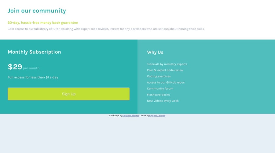
Design comparison
SolutionDesign
Solution retrospective
I would appreciate suggestions of other better ways I could have developed this site.
Community feedback
- P@RajCutinhaPosted over 4 years ago
Hello here is a List of what i would do after looking into your Site. Your Mobile Site looks good to me.
- Add a max-width to your flex-container i think 800px is fine// At some point items need to stop growing
- U should use % values for your boxes width so they can grow and shrink freely for box 1 use 100% and box2 and box 3 use 50%
- Add a flex-grow of 1 on box2 and box3 so they can take all the free space if u resize your window
- Add a flex-basis of 320px to box2 and box3 so if they have less space than 320px they wrap to the next line
I hope it was helpful.
1
Please log in to post a comment
Log in with GitHubJoin our Discord community
Join thousands of Frontend Mentor community members taking the challenges, sharing resources, helping each other, and chatting about all things front-end!
Join our Discord
