Mikołaj Kasperkiewicz
@PanMikolajAll comments
- @Jovaughn229Submitted over 2 years ago@PanMikolajPosted over 2 years ago
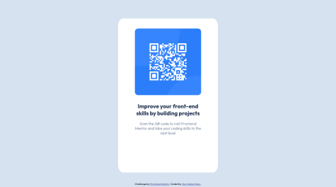
The card isn't centered on diffrent resolutions.
Try to work out with flexboxes .
If you don't know what flexbox is, you should definitely learn something about it, because it will be very useful for You in the future!
If You want some example code, feel free to go and check out my attempt of this challenge: https://www.frontendmentor.io/solutions/qr-code-component-qgm4m_84z
Good luck and have fun with other projects!
Marked as helpful0 - @cjdemilleSubmitted over 2 years ago@PanMikolajPosted over 2 years ago
Try to work out with padding, as you can see on the preview it is too big.
Maybe try "em" instead of "%" or get rid of padding and focus on each element width?
Other than that, well done!
If u want some code to check, here is my attempt of this challenge: https://www.frontendmentor.io/solutions/qr-code-component-qgm4m_84z
Good luck and have fun with other projects!
0 - @younesadjoudjSubmitted over 2 years ago
All feedbacks welcome.
@PanMikolajPosted over 2 years agoHi!
To get rid of accessiblity issues you should change your main
<div>to<main><main>works just the same as<div>but it is clearer to see the use of it.In addition you should get rid of
<div class="attribution">and put text that was inisde to another<p>that will be at the bottom of<main>. In my opinion it's just looks better.You should also change
<h2>to<h1>and bold your<p>with this whole "scan text".<p>Scan the QR code to...</p>If u want to see what i meant go check my own solution for this challenge: https://www.frontendmentor.io/solutions/qr-code-component-qgm4m_84z
Remember that I'm also a newbie and this is just my opinion on aesthetics.
Good luck and have fun with other projects!
Marked as helpful0


