Gideon Olumide Dada
@Olumide2596All comments
- @i-bluSubmitted about 2 years ago@Olumide2596Posted about 2 years ago
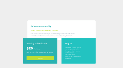
Hi, there, I went through your code and it seems you've not got to learning flexbox or grid yet. if you have, it will be nice to use it for this project, if not, nice job pulling this off, and be sure to try it again when you do learn flexbox.
Also, it's better to wrap all the divs in a container like this:
<body>
             <main>
                  <div class='container'>
                  </div>
            </main>
</body>
0 - @CodeLamp168Submitted over 2 years ago
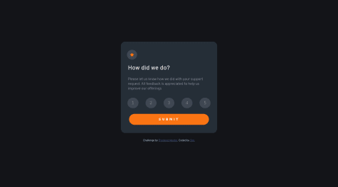
My first time ever using java-script independently and also using methods to implement specific styles and transitions after a click event.
My javascript format may be a bit sloppy and would love some tips on how I can make them cleaner and perhaps find different syntax to make it shorter.
@Olumide2596Posted over 2 years agoHello, completed this challenge yesterday and got some reviews that help me improve my code. This is the only part of the review I got that o think might be helpful to you.
You should use the
<main>element only to wrap the main content of the page. You should keep the attribution content in a<footer>element and out of the<main>element. These are semantic elements and are used to structure the page. You can read more about them here0 - @Olumide2596Submitted over 2 years ago
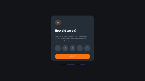
Feedback and any tips on how to improve my code are highly appreciated. Also, I'm having the challenge of unchecking a previous rating if I choose another. Thank you😁.
@Olumide2596Posted over 2 years agoThanks a lot, I will work on it using your feedback
0 - @Ax-cdSubmitted over 2 years ago
Hi! This is my solution, there are still a few things I would like help with:
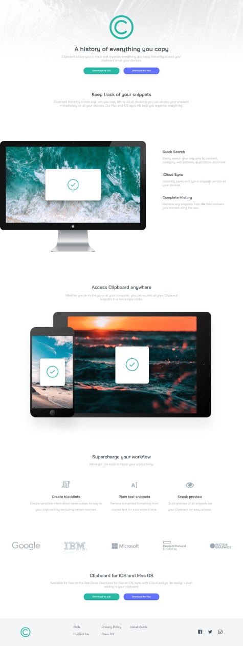
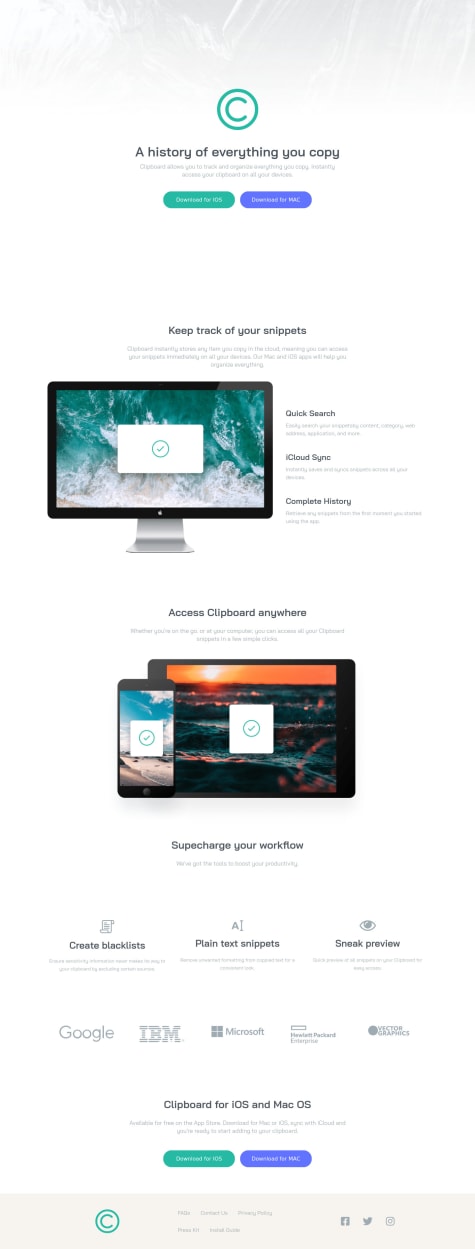
- How can I move the first image (the one of the computer) more to the left? I tried to use position relative/absolute, but since it didn't work I just used GRID...
- How can I align the "Supercharge your workflow" section in the center? I used Flexbox but it still doesn't work :/ Other criticisms are welcome, thank you :)
@Olumide2596Posted over 2 years ago- Try a margin-left of -^px(minus). then an overflow: hidden on the parent container.
0 - @pbitonga17Submitted over 2 years ago
I dont know how to put the monitor on the very left side of the screen. If someone knows please tell me :)
Also in this project i tried to use the 'clamp()' and added some basic animation on my header and button.
Any comment or advise will be appreciated. Thank you!
@Olumide2596Posted over 2 years agoi did a margin-left of -(minus) and overflow: hidddeon; on the parent
0
