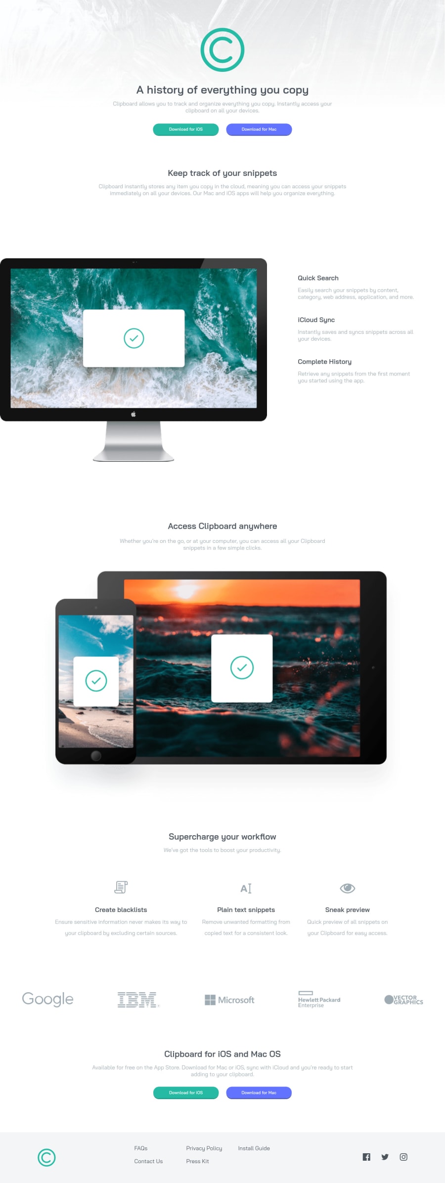
Design comparison
Solution retrospective
Hi! This is my solution, there are still a few things I would like help with:
- How can I move the first image (the one of the computer) more to the left? I tried to use position relative/absolute, but since it didn't work I just used GRID...
- How can I align the "Supercharge your workflow" section in the center? I used Flexbox but it still doesn't work :/ Other criticisms are welcome, thank you :)
Community feedback
- @vanzasetiaPosted over 2 years ago
Hi! 👋
Regarding your questions.
- For the computer image on the
section-1(which hopefully this is what you mean 😅), I usedtransform: translateX(<minus-value>)to move the image to the left. It works and luckily it doesn't cause overflowing issue. So, give it a try. - On my side, it's already center horizontally. I guess I don't understand your question. 😅 Could you explain what you are trying to achieve?
Some feedback.
- Swap the
headerwithdiv. If theheaderlives inside themainelement, it will miss the semantic meaning. However, I am afraid that it might confuse some of the screenreader users because the screenreader still think that it is aheaderlandmark. So, I recommend usingdivorsectiontag. - For your information,
headeris used to wrap the internal navigation for the website. In this case, there's no navigation links. But, there's a logo of the company so theheadershould only wrap the company logo. - Put the
footeroutside themainlandmark. It should be on its own landmark. Just likeheader, thefooterwill lose the semantic meaning if it lives inside themainelement. - Remove the word "logo" from the alternative text. The semantic meaning of the
imgelement will make the screenreaders pronounce it as image. - You have done a great job with the alternative text for the social media icons. 👏
- The download buttons should be link elements with
downloadattribute. - I don't recommend changing the
htmlor the:rootfont size. It can cause huge accessibility implications for those users with different font size or zoom requirements. I suggest reading this article by Josh Comeau where he tells about the problem of the 62.5% trick (and more!). Also, I recommend reading what an accessibility expert (Grace Snow) has said about it.
It's great that you have minified the CSS. However, it is really hard to give on your CSS. Currently, I have to open one by one the Sass files which makes it hard to give feedback. Also, not all people here understand Sass. So, I recommend creating the "non-minified" CSS for review.
That's it! Hope this helps. Happy coding!
Marked as helpful0@Ax-cdPosted over 2 years ago@vanzasetia Regarding my questions:
- I tried transform and it worked just fine, so thank you!
- For the "supercharge your workflow" section I should have precised that it is centered for me as well, but the elements underneath (create blacklists, plain text snippets, etc.) are not spaced evenly. But maybe it is a problem on my side?
I updated the HTML file based on what you said (landmarks, alt txt). For the accessibility issue I will keep it in mind for the projects and challenges I take from now on, thank you for the link to the article! Also I "de-minified" the CSS in order to make review easier.
Overall thank you so much for the feedback, it was most helpful!
0@vanzasetiaPosted over 2 years ago@Ax-cd For the "supercharge your workflow" section, I try making all of them have the same width by setting
flex-basis: 100%. It should fix the problem because currently, all the flex items are having different widths. So, that's why they have different spacing.For the CSS, I would suggest keeping the minified CSS for the site. The minified CSS is the one that is used. The "non-minified" CSS is for people to review. This way, the site still gain the performance benefit because of the minified CSS. Also, all people still can give feedback to your CSS code.
I notice in your CSS that you set the
htmlfont size to62.5%. I don't recommend changing thehtmlor the:rootfont size. It can cause huge accessibility implications for those users with different font size or zoom requirements. I suggest reading this article by Josh Comeau where he tells about the problem of the 62.5% trick (and more!). Also, I recommend reading what an accessibility expert (Grace Snow) has said about it.You're welcome! I am happy to know that it was really helpful for you! 😄
0 - For the computer image on the
- @Olumide2596Posted over 2 years ago
- Try a margin-left of -^px(minus). then an overflow: hidden on the parent container.
0@Ax-cdPosted over 2 years ago@Olumide2596 Hi! I tried but it doesn't work for some reason :/ maybe because the image is part of a grid, I don't know? But thank you for your reply!
0
Please log in to post a comment
Log in with GitHubJoin our Discord community
Join thousands of Frontend Mentor community members taking the challenges, sharing resources, helping each other, and chatting about all things front-end!
Join our Discord
