Not Found
Not Found
Not Found
Not Found
Not Found
Not Found
Not Found
Not Found
Not Found
Not Found
Not Found
Not Found
Not Found
Not Found
Not Found
Not Found
Not Found
Not Found
Not Found
Not Found

All comments

  • Daniel 🛸 44,230

    @danielmrz-dev

    Submitted

    What are you most proud of, and what would you do differently next time?

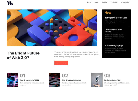
    🛸 Hello FEM Community! I'm Daniel and this is my solution for this challenge! 😊

    🛠️ Built with:

    • Angular 🅰️
    • SASS/SCSS 🎨
    • TypeScript 🤖
    • BEM Notation 🅱️
    • Mobile first workflow approach 📲

    First Angular project. Really enjoyed working with this amazing framework, even more than React. Nice project to practice and understand the tools Angular provides. I thought I would choose React as my primary framework, but I think I changed my mind. 😊

    Again, thanks to the Front-End Mentor team that creates challenges that make us learn a lot from doing them. 💟

    If you have any suggestions on how I can improve this project, feel free to leave me a comment!

    Feedback welcome 😊

    @Obed67

    Posted

    Bien joué vous êtes bon

    1
  • @Obed67

    Posted

    Joli design j'aime votre travail

    1
  • @Obed67

    Posted

    Hello @ kotovskyi07

    Your solution looks awesome!

    The background pattern with the circles is a little tricky, but here's how to do it:

    background-color: var(--Dark-cyan); background-image: url("./images/bg-pattern-top.svg"), url("./images/bg-pattern-bottom.svg"); background-repeat: no-repeat, no-repeat; background-position: right 52vw bottom 35vh, left 48vw top 52vh;

    Hope this helps!

    Other than that, you did a great job!

    0
  • @Obed67

    Posted

    Hello @davidlayobo _

    Your solution looks awesome!

    The background pattern with the circles is a little tricky, but here's how to do it:

    background-color: var(--Dark-cyan); background-image: url("./images/bg-pattern-top.svg"), url("./images/bg-pattern-bottom.svg"); background-repeat: no-repeat, no-repeat; background-position: right 52vw bottom 35vh, left 48vw top 52vh;

    Hope this helps!

    Other than that, you did a great job!

    0
  • @Obed67

    Posted

    Congratulations. You have succeeded in this challenge. Just remove the text that is in the background.

    Thank you

    0
  • Alok Suman 2,380

    @Alokray007

    Submitted

    In this challenge I faced issue with background image adjustment but somehow with the help of google I managed to do it. feedback related to margin and padding can be provided. I mostly use padding for providing gap between elements. Is it a right way, please guide.

    @Obed67

    Posted

    Well done sir. well done it's perfect

    0
  • Alok Suman 2,380

    @Alokray007

    Submitted

    👾 Hello, Frontend Mentor Community,

    This is my solution for the Single price grid component

    Scored 91% on Google Pagespeed Insights! 🤩 Minified the css files to improve site performance 🚀 Used Prettier code formatter to ensure unified code format ⚙️ Layout was built responsive via mobile first workflow approach 📲 Had a lots of fun while building this challenge ! 🤠 Feel free to leave any feedback and help me to improve my solution 💡 Thoughts :

    👨‍🔬 Follow me in my journey to finish all newbie challenges to explore solutions with custom features and tweaks

    Ill be happy to hear any feedback and advice !

    @Obed67

    Posted

    Well done sir. Congratulations on successfully completing the challenge. I like your design and your way of coding but you can do even more than that. Especially in terms of the length and width of the card, tried to adjust a little to be as close to the design as possible.

    THANKS

    0
  • Alok Suman 2,380

    @Alokray007

    Submitted

    This is my solution for the Interactive rating component challenge.

    I'm currently doing all layout just using core HTML, CSS & JS to clear my basic understanding. In which area I should improve. Please suggest.

    @Obed67

    Posted

    J'ai adoré. Le fonctionnement est parfait. Jusque le design n'est pas à la perfection selon la solution mais c'est déjà bon.

    1
  • @Obed67

    Posted

    Jolie design Tu peux faire mieux que ça. Par exemple la première image après le logo tu peux plus le recentrer pour plus de professionnalisme

    0