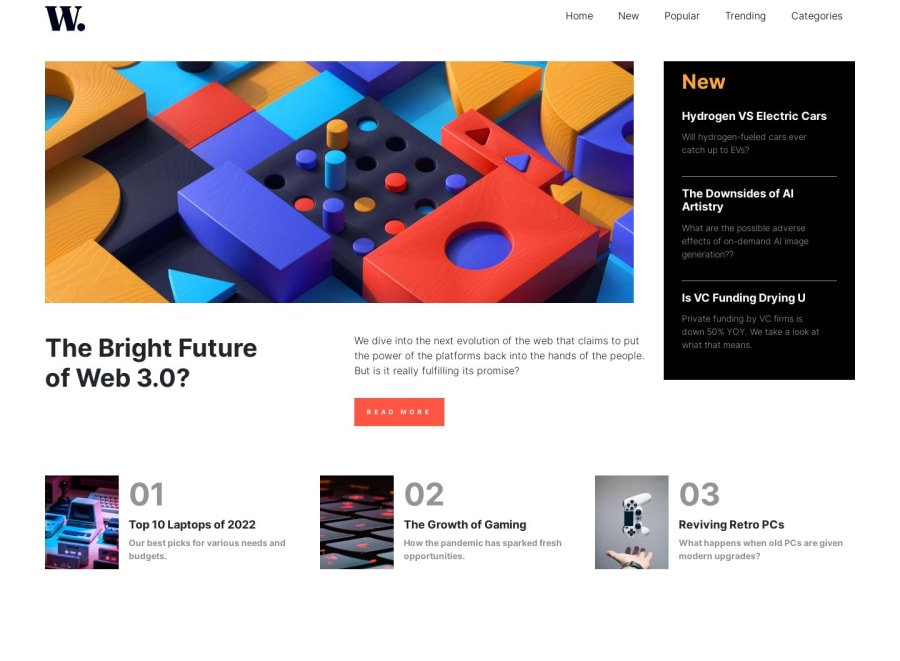
Design comparison
Solution retrospective
creating navigation bar for mobile side I have found difficult.
Community feedback
- @MelvinAguilarPosted 11 months ago
Hello there 👋. Good job on completing the challenge !
I have some suggestions about your code that might interest you.
- When you use the hover effect and
cursor: pointeron an element, it usually implies interactivity. To enhance user experience, consider wrapping all the news in an <a href="#"> tag. This way, users can click on it, expecting some action, like navigating to a page with more information about the new.
- The best way to code a navigation is to use the unordered list (
<ul>) inside a navigation (<nav>).
I hope you find it useful! 😄
Happy coding!
Marked as helpful0@ahasan06Posted 11 months ago@MelvinAguilar well got it.Thanks for the comment.
0 - When you use the hover effect and
- @waliddxPosted 11 months ago
This comment was deleted 9 months ago
0@ahasan06Posted 11 months ago@waliddx thanks for your suggetions . I will do it better in future .Its my first post and design at front-end mentor
0 - @Obed67Posted 11 months ago
Jolie design Tu peux faire mieux que ça. Par exemple la première image après le logo tu peux plus le recentrer pour plus de professionnalisme
0@ahasan06Posted 11 months agothanks for your suggetions . I will do it better in future .its my first post at front-end mentor@Obed67
0
Please log in to post a comment
Log in with GitHubJoin our Discord community
Join thousands of Frontend Mentor community members taking the challenges, sharing resources, helping each other, and chatting about all things front-end!
Join our Discord
