@Natalia912Submitted over 2 years ago

Natalia
@Natalia912All comments
- @Natalia912Posted over 2 years ago
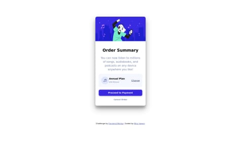
idk why it's different on the screenshot when the on the preview site it looks just fine
0 - @JaegerGBSubmitted over 2 years ago
What did you find difficult while building the project? I need to learn more about flex and practice
Which areas of your code are you unsure of? still not sure of positioning my elements, need to practice grids and flex more.
Do you have any questions about best practices? nope
- @JaegerGBSubmitted over 2 years ago
What did you find difficult while building the project? I need to learn more about flex and practice
Which areas of your code are you unsure of? still not sure of positioning my elements, need to practice grids and flex more.
Do you have any questions about best practices? nope
@Natalia912Posted over 2 years agohey! you are doing great. if you want to get rid of accessibility issues you could change your div.card element to main.card element. the other thing is to always use h1 tag in your solutions, so I would recommend to change your h4 tag to h1.
in your CSS i'd suggest make following changes:
in .card i'd change height property to fit-content so it wouldn't cut the bottom of your card
in .body i'd use flex and justified and aligned your card to center and add height property set to 100vh. you don't need to use margin in this case
Marked as helpful1 - @Natalia912Submitted over 2 years ago@Natalia912Posted over 2 years ago
somebody please explain me how to get the size of the container box right
1