Hi everyone.
As always I would like constructive criticism to improve the code.
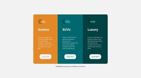
I noticed that when at the breakpoint with max-widht:1000 the container gets decentralized.
I have to work a lot to improve, but thanks to your great advice I think I have already made some small improvements.
Thanks for <3 everyone
I make this little changes on your css code, check it out, and, you don't necessary need 2 media querys on this case, I delete the one max-width: 600px; and just let the 800px, but I tell you again, check it out, I hope this was helpful for you c:
body{
min-height: 100vh;
display: flex;
flex-direction: column;
justify-content: center;
font-size: 15px;
font-family: 'Lexend Deca', sans-serif;
background-color: var(--very-light-gray);
margin: 0; // body has a little margin by default, quit it out whit this
}

.container{
padding: 20px;
max-width: 800px;
width: 100%;
display: flex;
flex-direction: row;
border-radius: 15px;
margin: 0 auto; // this is for center all the container
}
@media   screen and (max-width: 800px){
.container{
max-width: 500px;
display: flex;
flex-direction: column;
}
.border-1{
border-radius:15px 15px 0px 0px;
}
.border-3{
border-radius:0px 0px 15px 15px;
}
}