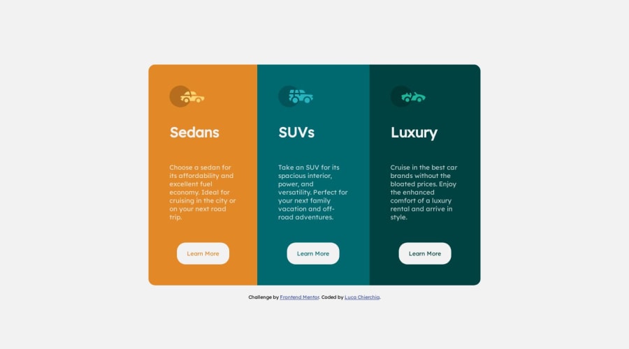


Design comparison

Solution retrospective
Hi everyone. As always I would like constructive criticism to improve the code. I noticed that when at the breakpoint with max-widht:1000 the container gets decentralized. I have to work a lot to improve, but thanks to your great advice I think I have already made some small improvements. Thanks for <3 everyone
Community feedback
- @fernandolapazPosted over 1 year ago
Hi 👋, perhaps some of this may interest you:
HTML / ACCESSIBILITY:
- The main content of every page (the card in this case) should be wrapped with the
<main>tag.
- Every page should have an <h1> to improve user experience and because it is an important element when it comes to SEO. The headings you used are fine, maybe add it at the beginning of the page and hide it with CSS for example...
- The icons are decorative images and therefore need an empty
altattribute to be ignored by a screen reader.
- And remember that
<button>should be used for any interaction that performs an action on the current page and<a>should be used for any interaction that navigates to another view. It seems that links are more appropriate in this case.
CSS:
- In addition to resetting the
box-sizinglike you did, it is also good practice to remove margins and padding to have a clean starting point and reduce differences between browsers:
* {
box-sizing: border-box;
margin: 0;
padding: 0;
}
Keep this in mind for future challenges.
- You forgot to capitalize the headings, it should be done using
text-transform: uppercase.
- It is better to use
min-height: 100vh;for the body, as usingheightcauses the page to be cut off in viewports with small height (such as mobile landscape orientation). This can also solve the problem that you mention about the position of the container at a certain breakingpoint.
- It might be good to get used to designing with the Mobile first approach, which means designing for mobile first and then for desktop or any other device, as it is widely considered best practice.
Please let me know if you want more info on any of these topics or disagree with something.
I hope it’s useful : )
Regards,
0@ElleCh9Posted over 1 year ago@fernandolapaz Thanks for the help, I will treasure your suggestions, I also took the liberty of analyzing your code on this challenge, really nice work ^^
1 - The main content of every page (the card in this case) should be wrapped with the
- @NVergilPosted over 1 year ago
I make this little changes on your css code, check it out, and, you don't necessary need 2 media querys on this case, I delete the one max-width: 600px; and just let the 800px, but I tell you again, check it out, I hope this was helpful for you c:
body{ min-height: 100vh; display: flex; flex-direction: column; justify-content: center; font-size: 15px; font-family: 'Lexend Deca', sans-serif; background-color: var(--very-light-gray); margin: 0; // body has a little margin by default, quit it out whit this } .container{ padding: 20px; max-width: 800px; width: 100%; display: flex; flex-direction: row; border-radius: 15px; margin: 0 auto; // this is for center all the container } @media screen and (max-width: 800px){ .container{ max-width: 500px; display: flex; flex-direction: column; } .border-1{ border-radius:15px 15px 0px 0px; } .border-3{ border-radius:0px 0px 15px 15px; } }0@ElleCh9Posted over 1 year ago@NVergil Hey I will definitely try to see the changes, thanks for your time. :)
1


Please log in to post a comment
Log in with GitHub
Join our Discord community
Join thousands of Frontend Mentor community members taking the challenges, sharing resources, helping each other, and chatting about all things front-end!
Join our Discord