MrKB03-creator
@MrKB03-creatorAll comments
- @GraceArianeSubmitted about 2 months ago
- @ECHL003Submitted about 2 months agoWhat are you most proud of, and what would you do differently next time?
I'm most proud of getting challenge complete! It got to the point where I was worried I'd have to scrap the whole thing and start again from scratch but I managed to trial and error my way to a decent looking site.
I was going to change up my naming scheme but ended using the same one I'd been using these previous challenges. My current naming scheme works for smaller projects but this one showed that it could become convoluted rather quickly. I'll try to adapt a better naming scheme next time.
What challenges did you encounter, and how did you overcome them?The media query was really difficult to get correctly. Having to stack the image on top the card was surprisingly difficult, but after messing around with a few values I managed to get the media query to work.
@MrKB03-creatorPosted about 2 months agoYou did a great work. Besides using just <p>, I recommend you try to use the different sizes of <h>. It will help you to have a better understanding of your code and better SEO on your websites.
1 - @mic-tech-1010Submitted about 2 months agoWhat are you most proud of, and what would you do differently next time?
i am proud of i was able to use css grid
@MrKB03-creatorPosted about 2 months agoLooks that you did a great job and learn a lot about grid
0 - @EnochofGodSubmitted about 2 months ago@MrKB03-creatorPosted about 2 months ago
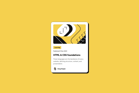
The design looks good, but the dimensions of the card appear to be larger than the intended design.
0 - @bmeinert8Submitted about 2 months agoWhat are you most proud of, and what would you do differently next time?
I'm proud of myself for being able to complete the project, as well as being able to resourcefully use my knowledge to be able to find solutions on my own without having to ask for outside help
What challenges did you encounter, and how did you overcome them?The biggest challenge I faced was getting proper alignment and style from desktop to the mobile version of the page. Furthermore being able to remove hover effects that are active in the desktop version that are not active in the mobile display.
What specific areas of your project would you like help with?I would like tips on how to improve my code from simplifications to more readable and cleaner code.
@MrKB03-creatorPosted about 2 months agoThe card design looks great within the 600px to 1040px range; however, the responsive mobile website needs some adjustments in its coding.
0 - @taufanremoteSubmitted about 2 months ago@MrKB03-creatorPosted about 2 months ago
The document appears to align with the design, but there are some slight variations in the text area.
0


