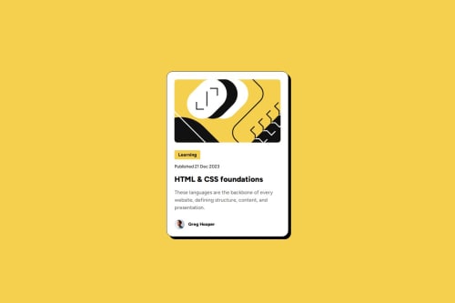
Blog Preview Card Challenge Submission

Solution retrospective
I'm proud of myself for being able to complete the project, as well as being able to resourcefully use my knowledge to be able to find solutions on my own without having to ask for outside help
What challenges did you encounter, and how did you overcome them?The biggest challenge I faced was getting proper alignment and style from desktop to the mobile version of the page. Furthermore being able to remove hover effects that are active in the desktop version that are not active in the mobile display.
What specific areas of your project would you like help with?I would like tips on how to improve my code from simplifications to more readable and cleaner code.
Please log in to post a comment
Log in with GitHubCommunity feedback
No feedback yet. Be the first to give feedback on Brian Meinert's solution.
Join our Discord community
Join thousands of Frontend Mentor community members taking the challenges, sharing resources, helping each other, and chatting about all things front-end!
Join our Discord