@Elizabeth2107Submitted 11 months ago
The logo does not look properly on bigger screens

The logo does not look properly on bigger screens
Hi, elizabeth! Just checked your solution and it looks good to me to some extent. Regarding the logo, I believe you've added some padding to the image on left side and that kind of shrinks it, I checked it in Dev tools, and if you try to remove that you'd see that it kind of improves lot. Also, mobile navbar could be handled in a better way too. Overall, well done ! If you need help, let me know !
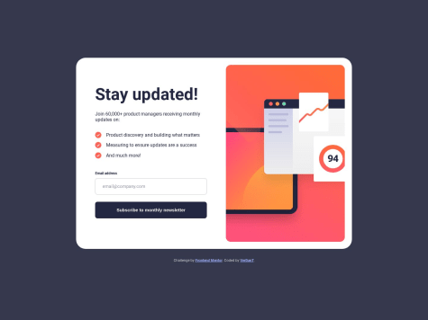
This project was made it with Vite + React 💻🤓
Any feedback will be appreciated 🤓
I just checked your design, it is very good and pretty neat when it comes to its responsiveness. One thing I did not understand was the usage of grid on the form section. if it is for learning reasons, then it is good. Otherwise, I would personally have not complicated it with CSS Grid. width:100% would have done the job for me. Why need a sledgehammer to crack a nut ? But, overall very neat code and perfect design. Kudos to you !
Hello There,
It's been a month since i start learning how to code. If you have a time please review my code and let me know if something i should look into or if there is any method that I'm using wrong.
Thank you in advance !
The design looks good but I guess there is a slight change needed in the font
It's great ! But, why use framework when the thing can be achieved with simple CSS?