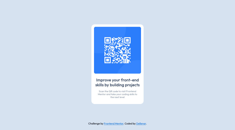
Design comparison
Solution retrospective
Hello There,
It's been a month since i start learning how to code. If you have a time please review my code and let me know if something i should look into or if there is any method that I'm using wrong.
Thank you in advance !
Community feedback
- @Bader-IdrisPosted over 1 year ago
You can set the container in the middle of the screen whatever user changes it when you add these properties to it in CSS:
.container {
  position: absolute;
  top:50%;
  left: 50%;
  transform: translate(-50%, -50%);
}
the new feature is transform, it has many lovely properties you can discover, I personally love it. Hope it's useful
0 - @StayOnBushPosted over 1 year ago
Hey there, you did a great job! One thing you can try is to not set width or height using pixel values when its not absolutely neccessary. I removed the width and height of your .card div and instead gave your article and qr-code image a max-width: 300px. This makes the outer divs more flexible and only limits the width of the children. In this case it doesnt make much of a difference but often it helps to keep the parent divs flexible and give only the kids elements a set width (especially when doing responsive designs). Hope that helps :)
0
Please log in to post a comment
Log in with GitHubJoin our Discord community
Join thousands of Frontend Mentor community members taking the challenges, sharing resources, helping each other, and chatting about all things front-end!
Join our Discord
