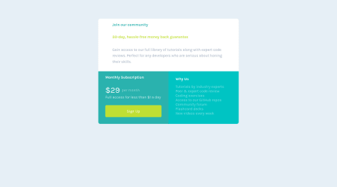
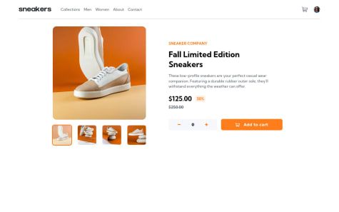
I use scss, I need feedback for improvement :) thank you
Luis Herrera
@Luis15HerrAll comments
- @gidhub48Submitted over 2 years ago@Luis15HerrPosted over 2 years ago
Very good work! I recommend you read about the bem methodology. Currently your scss code looks like this, example:
.main{

   div1{

       div2{

           div3{

           }

        }

    }

}
With the bem methodology you maintain the specificity of your classes, making it much easier to maintain the code.
Example of bem metodology with sames clases from above:
.main{...}

.main__div1{...}

.main__div2{...}
This way it will be much easier for you to make your css code :)
Marked as helpful0 - @JesusSan998Submitted over 2 years ago
how to valid email
@Luis15HerrPosted over 2 years agoYou can use a regex expression to validate the email and show the error :)
0 - @Darkfenix013Submitted over 2 years ago
All feeback is welcome.
@Luis15HerrPosted over 2 years agoBuen día amigo, muy buen trabajo para ser tu primera practica.
En el path de tu imagen, te hace falta un punto para especificar tu ruta.
actualmente lo tienes asi : <img src="/images/image-qr-code.png" class="img__qr">
Y deberias tener un punto por delante: <img src="./images/image-qr-code.png" class="img__qr">
Saludos :)
Marked as helpful0 - @richieAielloSubmitted over 2 years ago
Thanks for checking out my portfolio!
- @Maher0551071612Submitted over 2 years ago
I couldn't find free icons.
@Luis15HerrPosted over 2 years agoThe cart icon is in the ./images folder.
Marked as helpful0 - @MarcoFrancaSubmitted over 2 years ago
this is my first challenge
@Luis15HerrPosted over 2 years agoHello, you could use a:
background-size: cover;
In your class: .card--img
So that the background-img of your div: fills all the free space.
Marked as helpful0 - @Luis15HerrSubmitted over 2 years ago
Hello, everybody! 👋
Feedback is welcome and appreciated! 😊
Happy coding! 😁
@Luis15HerrPosted over 2 years agoSomeone knows why the font in the screenshots is a little lower than the webpage?
0 - @catherineisonlineSubmitted over 2 years ago
Hello, Frontend Mentor community! This is my solution to the URL shortening API landing page.
I appreciate all the feedback you left that helped me to improve this project. I fixed the issues I had previously and added new features per your recommendation.
I have done this project a while ago however if you are here and have any feedback, tips, or ideas to share, I will be more than glad to hear them out!
Thanks
- @ekremilkanSubmitted almost 3 years ago
Hi everybody. I completed this challenge but I've got some problems while trying to center the whole container. I'm open for any advice. Thank you so much :)
@Luis15HerrPosted almost 3 years agoHi, you can do it with display flex c:
You just have to give a height of 100% to your body tag and html tag and the align-item:center will work; what do you have c:
Marked as helpful1 - @soewaiyanagSubmitted almost 3 years ago
I learned so many things from this challenge. Let me know if there's something I can improve. And again thanks to FrontendMentor for creating this challenge.
- @PagChomperSubmitted almost 3 years ago
Please tell us if this code is clean thanks!
- @anoshaahmedSubmitted almost 3 years ago
I used desktop-first approach for this, and now I know for sure that mobile-first approach is best.
Please let me know what I can do to improve.
@Luis15HerrPosted almost 3 years agoWhy do you ask for feedback if you are going to delete the solution where the feedback was given? xDDDD
1


