Not Found
Not Found
Not Found
Not Found
Not Found
Not Found
Not Found
Not Found
Not Found
Not Found
Not Found
Not Found
Not Found
Not Found
Not Found
Not Found
Not Found
Not Found
Not Found
Not Found

All solutions

  • Submitted


    What are you most proud of, and what would you do differently next time?

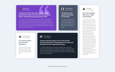
    With this exercise, I learned about the grid area and how do it in @media.

    .grid { display: grid; padding: 2rem; grid-template-columns: repeat(4, 1fr); grid-template-rows: repeat(2, 1fr); gap: 1.8rem; grid-template-areas: "a a b e" "c d d e"; }

    .item1 { grid-area: a; }

    .item2 { grid-area: b; }

    .item3 { grid-area: c; }

    .item4 { grid-area: d; }

    .item5 { grid-area: e; }

    @media (max-width:1000px) { .grid { grid-template-columns: 1fr; grid-template-rows: auto; gap: 1.8rem; grid-template-areas: "a" "b" "c" "d" "e"; } }

    What challenges did you encounter, and how did you overcome them?

    The strangest thing was the image position: absolute and his @media.

    .comillas { width: 115px; z-index: 1; position: absolute; right: 100px; top: 0px; }

    @media (max-width:1000px) { .comillas { width: 115px; right: 30px; } }

    What specific areas of your project would you like help with?

    Could I have solved it without using grid-template-areas?

  • Submitted


    What are you most proud of, and what would you do differently next time?

    With this exercise I learned that the grid is a bit difficult, I couldn't do it without @media.

    .grid { display: grid; grid-template-columns: repeat(3, 1fr); }

    @media (max-width:1000px) {

    .grid {
        grid-template-columns: 1fr;
    }
    

    }

    What challenges did you encounter, and how did you overcome them?

    I couldn't get the height of .card to work without setting it directly. And as for the image position, the only way I could think of was to use position

    .card { padding: 2rem; height: 16rem; position: relative;

    & img {
        margin-top: 2rem;
        width: 80px;
        position: absolute;
        right: 10%;
        bottom: 15%;
    }
    

    }

    What specific areas of your project would you like help with?

    How can I know the size of the exercise elements? Was there another way to place the image in that position?

  • Submitted


    What are you most proud of, and what would you do differently next time?

    With this exercise, I learned how to resize the grid in media.

    .grid { grid-template-columns: 1fr; grid-template-rows: 30vh 50vh; max-height: 800px; }

    What challenges did you encounter, and how did you overcome them?

    Where I had the most trouble was with resizing the image in the @media query because I couldn't get it to be the size I wanted in the grid.

    img { border-radius: var(--radius-grid) var(--radius-grid) 0 0; width: 100%; height: 100%; object-fit: cover; }

    What specific areas of your project would you like help with?

    I'd like to know the best way to find the average of the grid.

  • Submitted


    What are you most proud of, and what would you do differently next time?

    With this exercise, I learned something I had never done before: changing the color of the list item markers.

    li { list-style-type: inherit var(--color-Dark-Raspberry); }

    & ::marker {
        color: var(--color-Dark-Raspberry);
    }
    

    }

    What challenges did you encounter, and how did you overcome them?

    I also had to set the image to position: absolute in media, so that it wouldn't be affected by the div it was placed in.

    @media screen and (min-device-width: 325px) and (max-device-width: 600px) {

    .card {
        border-radius: 0px;
        margin: 150px auto 0px auto;
    
        & img {
            position: absolute;
            top: 0;
            left: 0;
        }
    }
    

    What specific areas of your project would you like help with?

    I’m not sure if the solution I gave for the image in the media query is the best one. How could I improve it?

  • Submitted


    What are you most proud of, and what would you do differently next time?

    I’m really proud of this CSS code because I made it mobile responsive without using any @media queries.

    .card { display: flex; flex-direction: column; max-width: 320px; margin: auto; padding: 40px; }

    Using place-content: center, I was able to align and justify it both vertically and horizontally.

    body { height: 100vh; place-content: center; max-width: 1440px; margin: auto; padding: 2rem; }

    What challenges did you encounter, and how did you overcome them?

    The challenge was the same as before, which is how to center it, but I can do it like this: body { place-content: center; max-width: 1440px; margin: auto; padding: 2rem; }

    What specific areas of your project would you like help with?

    There's one thing I don't quite understand, and that is exactly how much a rem measures. How could I find that out?

  • Submitted


    What are you most proud of, and what would you do differently next time?

    I’m really proud of this CSS code because I made it mobile responsive without using any @media queries.

    .card { max-width: 380px; margin: auto; padding: 20px; }

    What challenges did you encounter, and how did you overcome them?

    I had trouble centering the image on the screen. And this is the solution I came up with. Using place-content: center, I was able to align and justify it both vertically and horizontally.

    body { height: 100vh; place-content: center; max-width: 1440px; margin: auto; padding: 2rem; }

    What specific areas of your project would you like help with?

    I'm not sure if there's a better way to center the image and place the text below it better. I did this, but I don't know if it's the right way.

    .attribution { margin-top: 100px; font-size: 11px; text-align: center; }

  • Submitted


    What are you most proud of, and what would you do differently next time?

    I’m really proud of this CSS code because I made it mobile responsive without using any @media queries.

    h1 {
        font-size: clamp(2.2rem, 1.986rem + 0.571vw, 2.5rem);
    }
    
    .container {
        max-width: 1440px;
        margin: auto;
        padding: 2rem;
        display: grid;
    }
    

    Using place-content: center, I was able to align and justify it both vertically and horizontally.

    .container {
        display: grid;
        place-content: center;
    }
    

    What challenges did you encounter, and how did you overcome them?

    The biggest challenge for me was not using @media, instead relying on relative units, and making sure everything was centered on the screen.

    What specific areas of your project would you like help with?

    I’d like to know if this is actually the right way to do it to avoid using @media. Also, how can I improve my CSS writing skills?