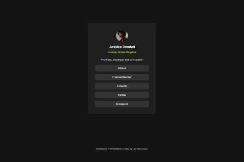
Social links profile solution

Solution retrospective
I’m really proud of this CSS code because I made it mobile responsive without using any @media queries.
.card { display: flex; flex-direction: column; max-width: 320px; margin: auto; padding: 40px; }
Using place-content: center, I was able to align and justify it both vertically and horizontally.
body { height: 100vh; place-content: center; max-width: 1440px; margin: auto; padding: 2rem; }
What challenges did you encounter, and how did you overcome them?The challenge was the same as before, which is how to center it, but I can do it like this: body { place-content: center; max-width: 1440px; margin: auto; padding: 2rem; }
What specific areas of your project would you like help with?There's one thing I don't quite understand, and that is exactly how much a rem measures. How could I find that out?
Please log in to post a comment
Log in with GitHubCommunity feedback
No feedback yet. Be the first to give feedback on Lara Mesa's solution.
Join our Discord community
Join thousands of Frontend Mentor community members taking the challenges, sharing resources, helping each other, and chatting about all things front-end!
Join our Discord