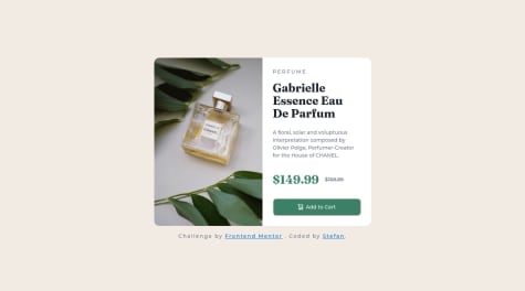
My flex box is not working properly . I did display:flex; justify-content:center ; align-items:center; but it didn't work , align-items:center is not working . So i used padding in body tag.
Stephan
@Kyr27All comments
- @SatyaaamSubmitted almost 2 years ago@Kyr27Posted almost 2 years ago
Add
min-height: 100vhto your body where flex is in order to center it:body{ background-color: hsl(212, 45%, 89%); display:flex; align-items:center; justify-content:center; min-height: 100vh; /*padding:100px;*/Marked as helpful1 - @HenriqueCosta05Submitted almost 2 years ago
Hello! I am new here, and would like from you: What are the best practices I should have put in this project? Is it possible to build a website for multiple platforms (Desktop, and Mobile) using only CSS and HTML? Thank you!
@Kyr27Posted almost 2 years agoBest practices:
- Always use indentation, some of your divs are not indented and that makes it harder to review code.
- Use a more descriptive alt attribute for your image.
- Don't use whitespace in your code:
<p> <span class="perfume">P E R F U M E</span></p>Instead use letter-spacing in your styles.css for that element:
.perfume { letter-spacing: 0.1875rem; }- Avoid using pixels as they're non-responsive, use rem or em instead.
- Instead of using:
text-decoration: line-through;Use the
<s>element in your index.html instead which is part of semantic HTML:<p><span class="discount-price">$149.99</span><s><span class="before-price">$169.99</span></s></p>- Whenever linking to another website, use the
rel="noopener"attribute(for security reasons)
Challenge by <a href="https://www.frontendmentor.io?ref=challenge" target="_blank" rel="noopener">Frontend Mentor</a>.- Avoid using
<span>to make a new line, it would be a nightmare to maintain. - If you're using Visual Studio Code, i would recommend you get the prettier extension and format your code using it.
Regarding your question of whether it's possible to build sites using only HTML and CSS for multiple platforms, the answer is yes, and that is the point of this challenge. To build for multiple platforms you should learn Flexbox and/or CSS Grid.
Marked as helpful1 - @Kyr27Submitted almost 2 years ago
I'm not sure if i did ARIA correctly, any help regarding how i can improve it is appreciated.
@Kyr27Posted almost 2 years agoFixed the left and right side height mismatch that was likely caused by the way flexbox handles paddings and margins behind the scenes, by centering using body instead:
! Don't use this to center the card:
  .product-container {
    display: flex;
    justify-content: center;
    align-items: center;

    min-height: 100vh;
    margin-inline: auto;
  }
! Use this instead:
body {
   min-height: 100vh;
   align-items: center;
   justify-content: center;
}
0


