Krzysztof Pawłowski
@KP1976All comments
- @forneiroSubmitted 18 days ago@KP1976Posted 13 days ago
- Read more about why you should not set font-size: 62.5%.
- Try to center verticaly your component.
0 - @gabrilovSubmitted about 2 months ago@KP1976Posted about 1 month ago
- Try to use table-related tags: <table>, <tr>, <td> etc. instead of divs and paragraphs.
- Use classes for styling instead of ids.
- You didn't use the correct color and font weight for the instruction list.
- You forgot about border-radius for the entire component and for the image in the desktop view.
- You used incorrect spacing between sections and set the line-height too small in paragraphs and lists.
0 - @laurentGurbalaSubmitted about 2 months agoWhat are you most proud of, and what would you do differently next time?
I am particularly proud of having implemented a mobile-first approach to manage the responsiveness of the site. This allowed me to ensure a good user experience on mobile while remaining flexible for desktop versions. In addition, the management of hover and focus states for interactive elements proved to be fluid and accessible.
What challenges did you encounter, and how did you overcome them?One of the biggest challenges I faced was managing the Inter variable font. Integrating a variable font and ensuring it worked correctly across browsers required me to understand how the font's variation axes (like weight and slant) worked. After doing some research and testing different approaches, I decided to use the static version of the font to ensure maximum compatibility.
@KP1976Posted about 2 months agoHTML
- Try to add meta tag with description to improve your SEO.
- You can change the <div> (class="card-profile") to an <article> tag.
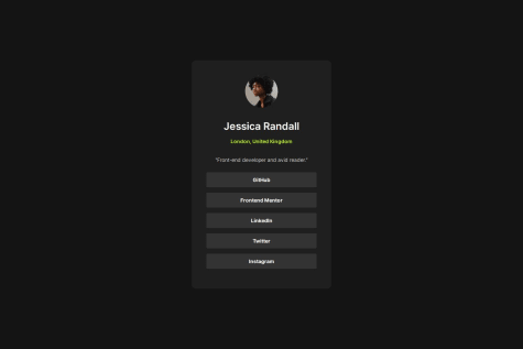
- Use alt text more descriptive: instead of "photo avatar" try for example "picture of user Jessica Randall".
- In this project you have a list of social media. I would suggest using the <ul> and <li> tags.
CSS
- I wouldn't use font-size: 62.5%. Here's a link explaining why not: font-size: 62.5%.
- In transition (.btn): Be more specific, use "color" instead of "all".
Other
- Amazing Read.me file!
1 - @AdrienneAEWSubmitted 4 months agoWhat are you most proud of, and what would you do differently next time?
I'm actually getting faster at building the simpler components and my confidence has grown. There are tons of ways to use flexbox properties to ger a site that's responsive across almost any browser. Still not sure if I like flexbox or css grid better. There are definitely times where either is better for the layout, but both are quite flexible and are a quick way to make esthetically pleasing and responsive layouts quickly and effective.
What challenges did you encounter, and how did you overcome them?How to get the text color and shadow to grow at the same time on hover. Still haven't figured that out.
What specific areas of your project would you like help with?Am looking forward to seeing how other coders handled text/shadow situation.
@KP1976Posted about 2 months ago-
Try to use @font-face with only two specific fonts: medium and extrabold
-
On body use min-height not height.
-
Try to use rem no pixels.
0 -
- @devsouzamahSubmitted 2 months ago@KP1976Posted 2 months ago
Try to use rem or em units instead of pixels. You can also add meta tag with description to improve your SEO.
Marked as helpful0