Design comparison
SolutionDesign
Community feedback
- @KP1976Posted 6 months ago
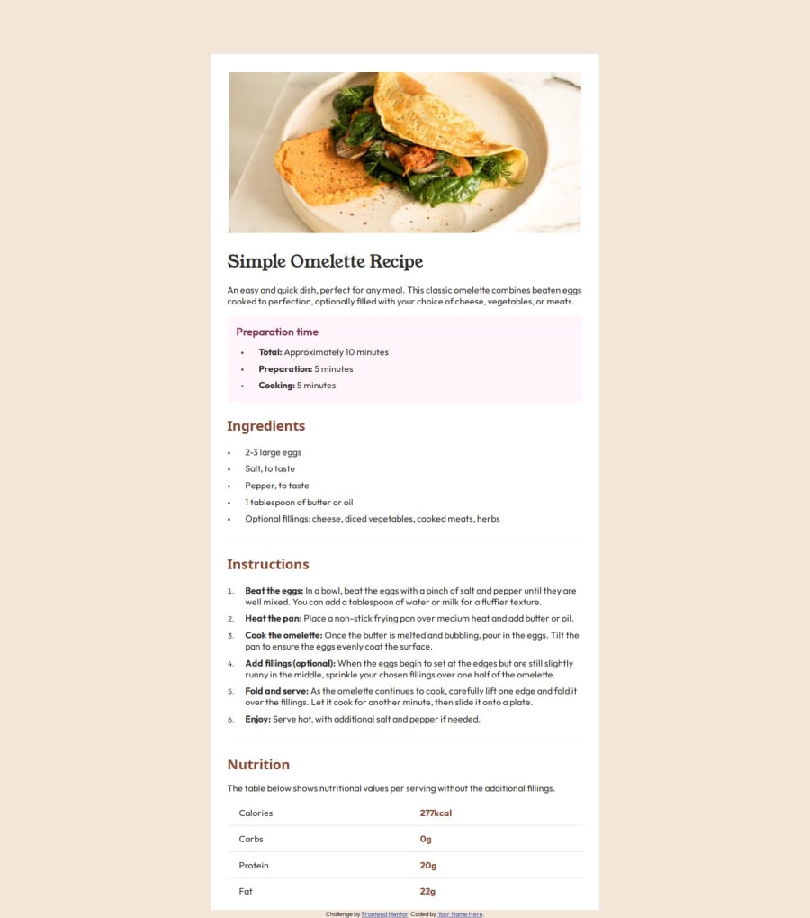
- Try to use table-related tags: <table>, <tr>, <td> etc. instead of divs and paragraphs.
- Use classes for styling instead of ids.
- You didn't use the correct color and font weight for the instruction list.
- You forgot about border-radius for the entire component and for the image in the desktop view.
- You used incorrect spacing between sections and set the line-height too small in paragraphs and lists.
0
Please log in to post a comment
Log in with GitHubJoin our Discord community
Join thousands of Frontend Mentor community members taking the challenges, sharing resources, helping each other, and chatting about all things front-end!
Join our Discord
