@Rikard-Johansson97Submitted almost 2 years ago

Jamal
@JamalLovesLoversAll comments
- @JamalLovesLoversPosted almost 2 years ago
Love it a bit of perfection needed though.
Firstly, love the new name and description makes your work stand out well. Secondly the colours are on point great start! The animations are so cool loving the creativity
as for the improvement: consider using a more realistic aspect ratio for your image they seem cutoff and look odd especially number 2 and 3. Next the selecting the amount of shoes seems to look off. Next the navbar needs improvement it works fine but looks off. The checout button in the cart just chills there when there is nothing in the cart which is strange.
Marked as helpful0 - @DiSSNiKOSubmitted about 2 years ago
'
@JamalLovesLoversPosted almost 2 years agoSeems like a few funcitonality issues exist, the add to cart or cart button don't work.
Use the correct font size Use the correct font use the correct words Use the correct colours given by frontend mentor. You have got a great base, needs a bit of work and feature adding and you will perfect this challange. Have a look at prop drilling if you are struggling with getting the cart functions to work. The modal is working perfectly great job!
1 - @sulemaan7070Submitted almost 2 years ago
I made this app✅ with all of my knowledge 💓. I had a little difficulty using tailwind since this is my first tailwind project. and also had a little difficulty in making it mobile-responsive. I have "not" used bootstrap or Material UI. feel free to point out any bugs or anything and I am open to any suggestions or advice... Thank you🫂, I can feel my FE skills are starting to get better😇
@JamalLovesLoversPosted almost 2 years agoHey awesome job looks like you have given it a solid go. Firstly, its pretty obvious right away that this website does not match the design given by frontend mentor which sometimes is a good thing but in this case there is way too much customization. The size of buttons icons, pictures is far too big and doesn't fit on the screen properly. Capitilisation is also an issue as stuff like 'cart' and 'fall' are not capitalised. For mobile I read that you didn't focus much on it but seems like the whole add to cart button is missing which is not good. The navbar is also rather large especially those icons, they are noticible of the bat. When the cart is empty the content looks strange, perhaps centering the no items in cart will help. Also spacing stuff out will too. When an image is clicked reduce the opacity and add a border on the thumbnail so it is apparant which one is clicked.
Positives
The function of the website is fantastic, I love that you can't add item to cart if it as 0 great addition. Also seems like while still on ipad level dimensions the website works great.
Feel free to mark this as helpful and ask for any questions i was unclear
1 - @YinkajaySubmitted about 2 years ago
Kindly review and test out. Cheers!
@JamalLovesLoversPosted about 2 years agoHey amazing. Use a gradient on the container to make the background color change from a ligher shade to dark. The functionality is great, every small detail has been catered to. I would be careful with the margin on the submit button and also the font size of certain buttons. Consider using aria labels to make it more accesible. The app seems to break a little bit on smaller screens landscape and potrait, so perhaps fix some issues in your media query. Otherwise great remake with amazing functionality!
Marked as helpful0 - @peterbujakySubmitted about 2 years ago
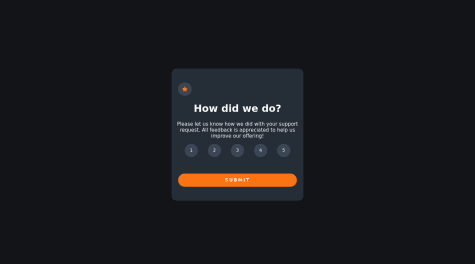
Feedback is welcome. I am particularly interested in finding out if there is another Javascript solution for making the submit button work only if the user has entered a rating.
@JamalLovesLoversPosted about 2 years agoGreat job! Firstly, you need to improve the width of the container it is way to narrow and looks rather odd. Secondly, the buttons are far too small and so is the text. Although you dont need to be pixel perfect, you need to try your best still. For the submit button make sure to use the correct font and font weight. Also be careful with the amount of padding you have used on the buttons its far too much. The functionality otherwise is great it does what its supposed to fast and well. Af for your question you can add a disabled attribute to the submit button and when the number is clicked that attribute is removed from the button. Use the setAtrribute() function combined with the addEventListener function!
Marked as helpful0 - @BennyBenVSubmitted about 2 years ago
Hi ! This is my solution for this challenge. It was my first time with JavaScript and I had many difficulties to understand the language. I'm still learning JS with differents websites and I'll do others challenges.
Like always, I'll be greatful for feedbacks !!
@JamalLovesLoversPosted about 2 years agoThis seems to be unfinished. You need to add a transition delay on all the button to ensure that the website looks smooth. Make sure to use aria labels for better accesability. Use the font given instead of a regular one as it looks odd. The button once clicked does not change to the orange that it is supposed but instead a greying colour. Make sure you are using the correct colours as well. Set the pointer to cursor when hovering over a selectable element making it clear that it is a button. Use the correct font size. Nice rate again button but it was not required.
Marked as helpful0