Skip to content
Learning paths
Challenges
Solutions
Articles
Unlock Pro
Log in with GitHub
Profile
Overview
Solutions
4
Comments
1
Helmer302
@Helmer135
Follow
All solutions
Submitted over 1 year ago
Space Tourism website built with React
HTML
CSS
JS
0
4
0
Submitted almost 2 years ago
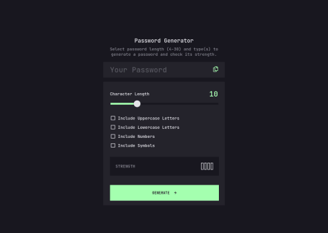
Vanilla JS Solution for Password Generator
HTML
CSS
JS
1
2
0
Submitted about 2 years ago
Testimonials Grid Section
HTML
CSS
1
2
0
Submitted almost 3 years ago
Responsive Preview Card Component
HTML
CSS
1
1
0
