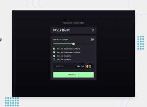
Design comparison
Solution retrospective
Hi,
When I working on responsive views, I found that when the screen size is near the breakpoint, but not yet reached it, the appearance is really bad. Especially when there's a long password or strength text (i.e. TOO WEAK!), they just overflow the container.
Thank you!
----------- Edit ------- I further adjust the breakpoint and margin for a better responsive view. I think they look well now. But is there a good solution to that? I'd love to improve my code for that.
Community feedback
- @fazzaamiarsoPosted almost 2 years ago
Hi HELMER302’S! Great job!
Since you're using flex container, to fix overflow you can add
flex-wrap: wrapproperty.I hope it helps! Cheers!
0@Helmer135Posted almost 2 years ago@fazzaamiarso Hi, thank you for the comment.
I've wrapped them already, but it didn't work, I think it's because the children elements are all in-line displayed, so it won't go to the next line.
But I did adjust font size and margins for the smaller screen view, I think it looks better now.
0
Please log in to post a comment
Log in with GitHubJoin our Discord community
Join thousands of Frontend Mentor community members taking the challenges, sharing resources, helping each other, and chatting about all things front-end!
Join our Discord
