Not Found
Not Found
Not Found
Not Found
Not Found
Not Found
Not Found
Not Found
Not Found
Not Found
Not Found
Not Found
Not Found
Not Found
Not Found
Not Found
Not Found
Not Found
Not Found
Not Found

All comments

  • Eric 70

    @esurreal

    Submitted

    What are you most proud of, and what would you do differently next time?

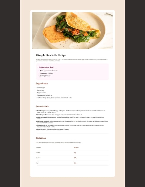
    I resubmitted the solution with the desktop design.

    What challenges did you encounter, and how did you overcome them?

    I was not able to change the color of the numbers in the list. Also, not sure how big to make this on the desktop, but it seems to work in the responsive tests.

    What specific areas of your project would you like help with?

    Any helpful tips or tricks are always appreciated.

    @Hadisuhail188

    Posted

    you can change the colours of the ordered list items by doing: ol{ color: "the color you want" }. the reason why this will work is because this is the only section with ordered list items

    0
  • @Hadisuhail188

    Posted

    To make the picture display show up try putting the picture in the same location as your index file.

    Try using border radius to round the edges.

    Marked as helpful

    1
  • P
    Benhemin 180

    @Benhemin

    Submitted

    What are you most proud of, and what would you do differently next time?

    .

    What challenges did you encounter, and how did you overcome them?

    .

    What specific areas of your project would you like help with?

    .

    @Hadisuhail188

    Posted

    The best way to distinguish between mobile and desktop width sizes involves using media queries in your CSS.

    eg: @media only screen and (min-width: 768px) { /* Desktop-specific styles */ .container { width: 80%; margin: 0 auto; padding: 20px; } }

    the min-width 768 is just an example so you might have to make some changes.

    0