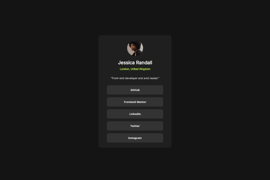
Design comparison
Solution retrospective
I think I did a pretty good job replicating the webpage provided. In the future I need to remember that images need set heights and widths otherwise different browsers and os's can make the page look very wonky.
What challenges did you encounter, and how did you overcome them?As stated before the only real issue I encountered was that my page did not look correct on iOS. When attempting to go to the live site on my iPhone the profile picture would get distorted and start to look larger than it should. I found out that this was because I did not set an exact height and width for the image and instead only a percentage based one. This can cause issues depending on the browser and OS apparently.
What specific areas of your project would you like help with?I think I am happy with all areas in this project, but I am open to criticisms.
Community feedback
- @AdrianoEscarabotePosted 6 months ago
Hi ramagall, Welcome to Front-end Mentor!!
How are you doing? I really loved the outcome of your project, but I have a few suggestions that I think might be helpful:
I noticed that there is a scrollbar on your website to solve this we can do the following:
body
    margin: 0;
}
A tip to improve the semantics of the code would be to use ul, since that is a list of links:
<ul>
    <li><a href="#">GitHub</a></li>
    <li><a href="#">Frontend Mentor</a></li>
    <li><a href="#">LinkedIn</a></li>
    <li><a href="#">Twitter</a></li>
    <li><a href="#">Instagram</a></li>
</ul>
The rest is excellent.
I hope you find it useful. 👍
Marked as helpful0 - @Hadisuhail188Posted 6 months ago
I think it is great but you could improve it by linking your social accounts to the buttons
0
Please log in to post a comment
Log in with GitHubJoin our Discord community
Join thousands of Frontend Mentor community members taking the challenges, sharing resources, helping each other, and chatting about all things front-end!
Join our Discord
