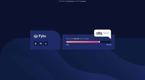
How to make it responsive using css grid. It wasn't working when i use grid to display smaller screen.
Gloryjaw
@GloryjawAll comments
- @Pe-te-rSubmitted 7 months agoWhat specific areas of your project would you like help with?@GloryjawPosted 7 months ago
Nice work with challenge. There are some shortcomings.
1.) First, answer to your question, use media query for the different sizes. One way I use is first develop the mobile design, then apply media query for tablet design and then finally, another media query for desktop design.
2.) Your code is not semantic, try not to use lot of div tags and use more semantic tags. (You can search about semantic tags if you don't know about them.)
3.) I can see in your code that you have media query at the middle of code, that's not a good practice. Always put your media queries at the end of your CSS file. The reason for that is CSS will override media query if it is not at the end of CSS file.
That's all for me, keep coding.
Marked as helpful1 - @onwuemenejoshuaSubmitted over 2 years ago
- Pls, what can I do to make the mobile view highly responsive, especially regarding the Image??
- pls, how do I position the container(Image and content(text)) in the middle of the page(desktop view)?
- pls, how can I make both the image and the content(text) to be of equal width?
@GloryjawPosted over 2 years agoHi, nice try on the challenge.✨ There are lots of things you can do to improve the design. Some of them are-->
- Using % as widths to make your items responsive.
- You can give body display flex and height 100vh. Then use justify content and align items to center the whole container in the middle
- Images are by default not responsive, you should give them widths(in % of course). It will adjust its height according to aspect ratio.
Marked as helpful0 - @youtubbehSubmitted over 2 years ago
I tried to make it so the content on the right side reduced its width progressively instead of changing abruptly, but couldn't do it. I tried all sorts of width and max-width values, as well as flex-shrink.
If you have any advice on how to do it, I'd be very thankful!
@GloryjawPosted over 2 years agoHii, nice work on the challenge. It looks awesome.The few things you can do to make it look like the original design is -->
-
You should use width in percentages instead of px to make change in widths progressively. Using width in percentage will adjust the width relative to its parent. So,width:75% means 75% of the parent width.
-
Border radius of the GB left popup in desktop screen is little more than it should be, reduce it.
-
Try to make your html code a little semantic.(using section, buttons tags instead of div).
Marked as helpful0 -


