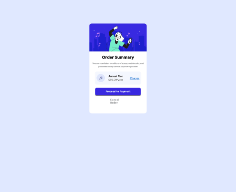
Tive dificuldade em posicionamentos do CSS.
Gautham R Vanjre
@GauthamRVanjreAll comments
- @cardozo309Submitted almost 2 years ago@GauthamRVanjrePosted almost 2 years ago
Hi David, on large screens the button is overflowing out of the box. You can solve this in 2 ways:
- Increase the height of the box and keep the spacing as it is.
- Or, you can give negative margin-top to the button to fit it inside the box. Both solutions work but first way is highly advised because it visually looks good.
0 - @TLBTrung-222Submitted almost 2 years ago@GauthamRVanjrePosted almost 2 years ago
Hello Trung_TLB, you have done a great job. Only one piece of feedback from my side, as you can see in the design the font size is large so as to highlight the text. In order to improve visibility try to increase the font-size of the text part so that it can catch the eye of the user.
Marked as helpful1 - @GauthamRVanjreSubmitted about 2 years ago@GauthamRVanjrePosted about 2 years ago
Yes, I made this mistake. Thank you for pointing it out
0 - @DINIPRESubmitted about 2 years ago
Hi, so i just concluded my first project and I'd appreciate it if you check it out for me. I'd love to get feedback on my work. Thanks.
@GauthamRVanjrePosted about 2 years agoHello Zaya, first all of welcome to the front-end mentor. I saw your result code and here are some improvements you can make from my side.
- give some padding to the image inside the card
- margin-bottom to the image looks a bit cluttered
- try to reduce the height of the card div , it looks too big for this challenge. Thank you.
Marked as helpful0


