Skip to content
Learning paths
Challenges
Solutions
Articles
Unlock Pro
Log in with GitHub
Profile
Overview
Solutions
9
Comments
2
eshrak
@EshrakRahman
Follow
All solutions
Submitted about 1 year ago
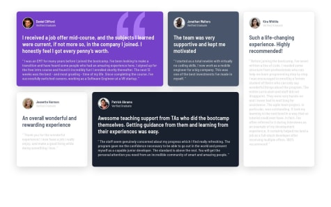
Testimonials grid section solution using grid
HTML
CSS
0
4
0
Submitted about 1 year ago
Profile card component solution using flexbox
HTML
CSS
0
6
0
Submitted about 1 year ago
Stats preview card component solution using grid
HTML
CSS
0
2
0
Submitted about 1 year ago
Order summary component using flexbox
HTML
CSS
0
4
0
Submitted about 1 year ago
NFT-preview-card-component using flexbox
HTML
CSS
0
5
0
Submitted about 1 year ago
Product preview card component solution using flexbox
HTML
CSS
0
6
0
Submitted about 1 year ago
3-column-preview-card-component using flexbox
HTML
CSS
0
4
0
Submitted about 1 year ago
QR-code-component-challenge using flexbox
HTML
CSS
0
6
0
Submitted about 1 year ago
Results summary component solution using flexbox
HTML
CSS
0
4
0
